
In this article, we’ll introduce the key concepts of time series forecasting. We will be using data from monthly anti-diabetic sales index on the Australian market between 1991 and 2008.
The data I’m using can be downloaded from https://maelfabien.github.io/assets/files/file.csv.
Start by importing the following packages :
import numpy as np
import pandas as pd
import matplotlib.pyplot as plt
import seaborn as sns
from sklearn import preprocessing
Then, load the data :
df = pd.read_csv('file.csv', parse_dates=['date'], index_col='date')
df.head()
| value | date |
| 1991-07-01 | 3.526591 |
| 1991-08-01 | 3.180891 |
| 1991-09-01 | 3.252221 |
| 1991-10-01 | 3.611003 |
| 1991-11-01 | 3.565869 |
I. The process behind forecasting
The key steps behind time series forecasting are the following :
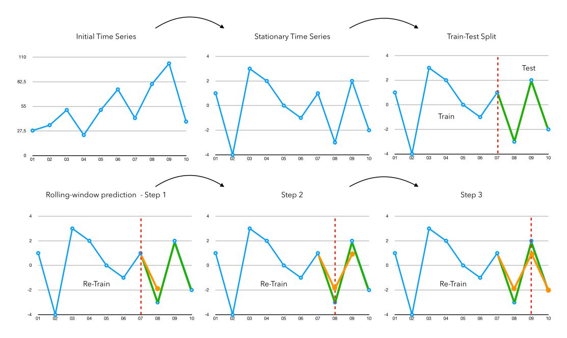
- Step 1: Make the Time Series Stationary (we’ll cover that in this article)
- Step 2: Split the Time Series into a train and a test to fit future models and compare model performance. If we are in prediction, we take the whole data as train and apply no test.
- Step 3: Rolling window forecasting. We fit the chosen model on all data available and forecast the next value.
- Step 4: We attach the prediction of the previous step to the observations, and re-fit the model on all available data to make a prediction
- Step 5: Once we finished our rolling window and have an array of predictions, we just need to apply the inverse transformation that we applied for the stationarity transformations.
- Step 6: We can assess the performance of a model by applying simple metrics such as MSE.
II. Is the series stationary?
The first question you should ask is: Is the series stationary? There are several ways to check this :
- by looking at the plots
- by running an ADFuller test
We can first plot the time series :
plt.figure(figsize=(12,8))
plt.plot(df['value'], label="value")
plt.title("Monthly anti-diabetic sales index on the Australian market between 1991 and 2008")
plt.legend()
plt.show()
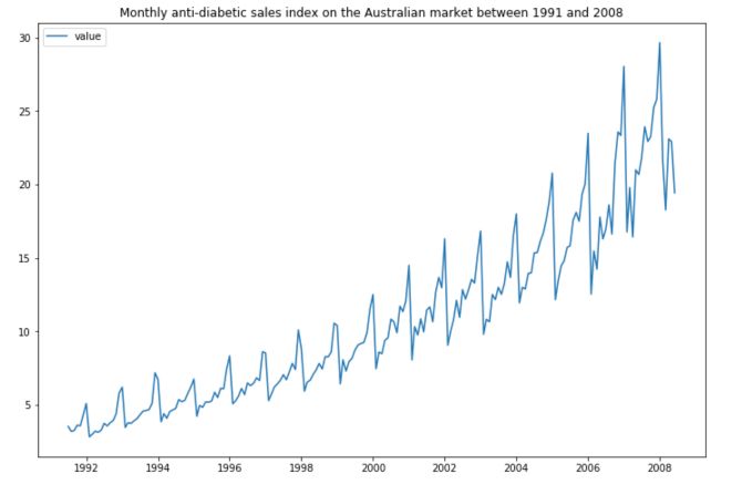
As we mentioned in the article “Key Concepts in Time Series”, it is really important that your series is stationary before applying any model on it. The time series does not look stationary at that point. But is it really the case? We can run an ADFuller test to confirm this statement.
from statsmodels.tsa.stattools import adfuller

result = adfuller(df['value'].ffill(0))
print('ADF Statistic: %f' % result[0])
print('p-value: %f' % result[1])
print('Critical Values:')
for key, value in result[4].items():
    print('\t%s: %.3f' % (key, value))
The output is :
ADF Statistic: 3.145186
p-value: 1.000000
Critical Values:
    1%: -3.466
    5%: -2.877
    10%: -2.575
The more negative the AD-Fuller, the more likely we are to reject the null hypothesis and the more likely we are to have a stationary dataset.
As part of the output, we get a look-up table to help determine the ADF statistic. We can see that our statistic value of 3.14 is way higher than the value of -2.5 at 10%.
We cannot reject the null hypothesis, meaning that the process has a unit root and the time series is not stationary according to ADF test.
Let’s start our journey towards a stationary time series :)
III. Remove Heteroskedasticity
The first thing you’ll notice when looking at the time series above it the fact that the series has an increasing variance. It might be a real issue since time series are not good at predicting increasing variance over time.
To make the time series stationary, we need to apply transformations to it. Usual transformations to remove heteroskedasticity (or increasing variance over time) include :
- log
- square root
- …
To make sure that the log transformation would make sense, just plot it :
plt.figure(figsize=(12,8))
plt.plot(np.log(df['value']))
plt.show()
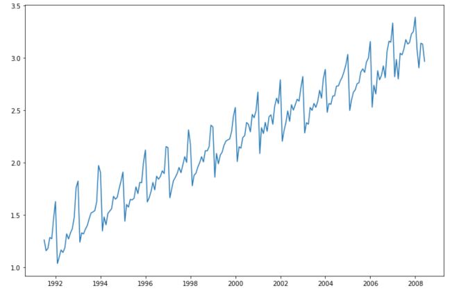
Applying a log transform is definitely a good idea here (but it’s by far not always the case). Moreover, the log transform comes along with some advantages in terms of interpretation :
- Trend measured in natural-log units ≈ percentage growth
- Errors measured in natural-log units ≈ percentage errors
IV. Remove the trend
The next step is to remove the trend from the series. Do you see any kind of trend that could fit?
Well, the linear trend is pretty much what we’re looking for! Other popular trends including exponential or logarithmic trends for example.
from sklearn.linear_model import LinearRegression

X = np.array(range(len(np.log(df['value']))))
y = np.log(df['value']).ffill(axis=0)

# Linear Trend
reg = LinearRegression().fit(X.reshape(-1,1), y)
pred_lin = reg.predict(X.reshape(-1,1))

# Logarithmic trend
a_1,b_1 = np.polyfit(np.log(X+1), y, 1)
pred_log = a_1 * np.log(X+1) + b_1

# Exponential trend
a_2,b_2 = np.polyfit(X+1, np.log(y), 1)
pred_exp = np.exp(b_2) + np.exp( (X+1) * a_2)

plt.figure(figsize=(12,8))
plt.plot(np.log(df['value']), label="Index")
plt.plot(df['value'].index, pred_lin, label="linear trend")
plt.plot(df['value'].index, pred_log, label="log trend")
plt.plot(df['value'].index, pred_exp, label="exp trend")
plt.legend()
plt.show()
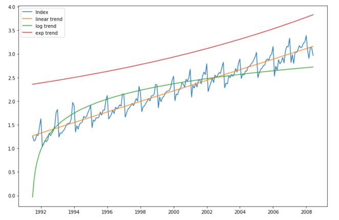
The linear trend is the best fit in this case. Our new series now becomes :
log(Initial series) - linear trend
To rebuild the final series, you would need :
exp(value) + linear trend at that index
Let’s define our new series :
series = np.log(df['value'])-pred_lin
plt.figure(figsize=(12,8))
plt.plot(series)
plt.show()
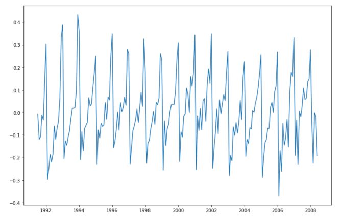
V. Remove Seasonality
Seasonality in time series denotes a recurrent pattern over time. When a series is seasonal, it means that value at a given point in the past is really close to the value we observe today.
In the graph above, it seems to be the case. There seems to be a yearly pattern in the way this time series evolves.
The seasonality might take the form of a large peak, a sinusoidal curve…
There are mainly two ways to model seasonality in time series :
- identify patterns that look sinusoidal for example, and fit the right parameters
- the easiest option to remove the trend is to compute the first difference. For example, if there is a yearly seasonality, we can take $ y_t $ - $ y_{t-12} $ (since the measures are made monthly)
The most common way is the difference transformation. We subtract the value 12 months ago to the value of today.
plt.figure(figsize=(12,8))
plt.plot(series - series.shift(12))
plt.show()
This way, all we have left to forecast is how different we will be from the same point in time 12 months ago. It makes our whole computations easier.
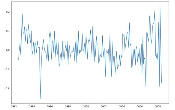
We have removed most of the trend here, and remain with a stationary series. To make sure that our series is stationary, we can look at the plot: There seems to be no recurrent pattern in the data, constant variance and mean, no trend… And we can compute the ADFuller test again!
series_stationary = series - series.shift(12)
result = adfuller(series_stationary.dropna())
print('ADF Statistic: %f' % result[0])
print('p-value: %f' % result[1])
print('Critical Values:')
for key, value in result[4].items():
    print('\t%s: %.3f' % (key, value))
And print the results :
ADF Statistic: -5.214559
p-value: 0.000008
Critical Values:
    1%: -3.467
    5%: -2.878
    10%: -2.575
The p-value is close to 0, and the ADF Statistic is below the 1% critical value. We reject the null hypothesis that the series has a unit root and is not stationary. The series is therefore stationary!
VI. Model the time series
In this article, I won’t cover the details and the different models of time series forecasting. I’ll cover that in future articles. I will pick a SARIMA model and try to make predictions.
We first built the train and test sets :
# ARIMA
from statsmodels.tsa.arima_model import ARIMA
size = int(len(series_stationary.dropna()) * 0.75)
train, test = series_stationary.dropna()[0:size], series_stationary.dropna()[size:len(series_stationary.dropna())]
test = test.reset_index()['value']
history = [x for x in train]
predictions = []
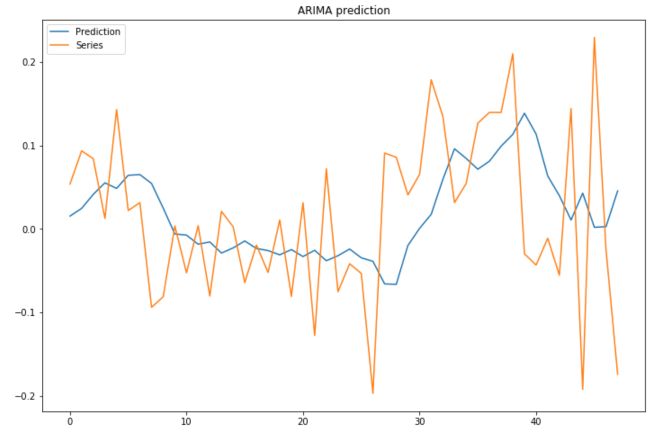
Then, to assess the performance of the model, we will make our model predict the next value using only real training value. In other words, we apply the rolling window, and at each step, we give the model once more observation to predict from instead of using the last predicted value. This is a common way to better assess the performance of a model.
for t in range(len(test)):
    model = ARIMA(history, order=(1,1,1))
    model_fit = model.fit(disp=0)
    output = model_fit.forecast()
    yhat = output[0]
    predictions.append(yhat)
    obs = test[t]
    history.append(obs)
We can plot our prediction in front of the test :
plt.figure(figsize=(12,8))
plt.plot(predictions, label="Prediction")
plt.plot(test, label="Series")
plt.title("ARIMA prediction")
plt.legend()
plt.show()
To assess the performance of the model, simply use :
from sklearn.metrics import mean_squared_error
mean_squared_error(predictions, test)
VII. Build Predictions
Alright, we now have all the elements to recompose the time series ! To make a prediction, we start by taking the value from 1 year ago :
start_idx = 204
end_idx = 250
series = series_stationary.reset_index()['value']

for i in range(start_idx, end_idx) :
    series[i] =  series[i-12]
Then, add a linear trend effect :
X_full = np.array(range(0, end_idx))
pred_lin = reg.predict(X_full.reshape(-1,1))
Then, add the prediction of the time series (I’ve chosen a SARIMA model here) :
history = [x for x in series[:start_idx]]
predictions = list()

for t in range(end_idx-start_idx):
    model = SARIMAX(history, order=(1, 1, 1), seasonal_order=(1, 1, 1, 12))
    model_fit = model.fit(disp=False)
    output = model_fit.forecast()
    yhat = output[0]
    predictions.append(yhat)
    history.append(yhat)
Then, we can plot the prediction :
plt.figure(figsize=(12,8))
plt.plot(df.reset_index().value, label="Series")
plt.plot(np.exp(series[204:]+pred_lin[204:]) + np.array(predictions), label="Recompose + SARIMA")
plt.legend()
plt.show()
You might now wonder what would have happened if we applied the model on non-stationary data. Well, let’s try it out!
# SARIMA example
from statsmodels.tsa.statespace.sarimax import SARIMAX

size = int(len(df['value'].dropna()) * 0.75)
train, test = df['value'].dropna()[0:size], df['value'].dropna()[size:len(df['value'].dropna())]
test = test.reset_index()['value']
history = [x for x in train]
predictions = list()

for t in range(len(test)):
    model = SARIMAX(history, order=(1, 1, 1), seasonal_order=(1, 1, 1, 12))
    model_fit = model.fit(disp=False)
    output = model_fit.forecast()
    yhat = output[0]
    predictions.append(yhat)
    obs = test[t]
    history.append(yhat)

history = [x for x in train]

plt.figure(figsize=(12,8))
plt.plot(np.concatenate([history, predictions]), label='Prediction')
plt.plot(np.concatenate([history, test]), label='Test')
plt.legend()
plt.show()
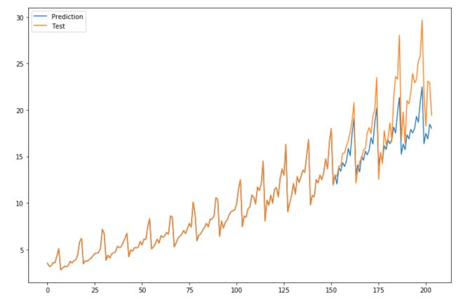
I hope this quick example convinced you of the impact of making your time series stationary.
Conclusion: I hope you found this article useful. Don’t hesitate to drop a comment if you have a question.