
I. What is a time series?
Time series is a series of data collected with the same unit over several successive periods.
Examples of time series include :
- daily exchange rate
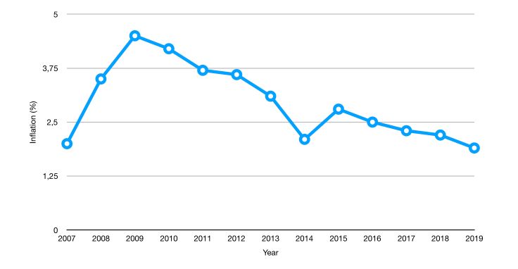
- yearly inflation
- consumption of a certain good per month
- …
Time series are used for :
- forecasting
- estimating causal effects
- estimating correlation over time
We’ll define the following notations :
- The value of \(y\) at time \(t\) is given by \(y_t\)
- The data points are : \(y_1, ..., y_T\)
- The first difference is given by : \(\Delta y_t = y_t - y_{t-1}\)
II. Illustration using Open Data
1. The data
To illustrate the main concepts related to time series, we’ll be working with time series of Open Power System Data (OPSD) for Germany.
The data set includes daily electricity consumption, wind power production, and solar power production between 2006 and 2017.
- Date — The date (yyyy-mm-dd format)
- Consumption — Electricity consumption in GWh
- Wind — Wind power production in GWh
- Solar — Solar power production in GWh
- Wind+Solar — Sum of wind and solar power production in GWh
The data can be downloaded here
Start by importing the following packages :
### General import
import numpy as np
import pandas as pd
import matplotlib.pyplot as plt
import seaborn as sns
from sklearn import preprocessing
import statsmodels.api as sm

### Time Series
from statsmodels.tsa.ar_model import AR
from sklearn.metrics import mean_squared_error
from pandas.tools.plotting import autocorrelation_plot
from statsmodels.tsa.arima_model import ARIMA
from statsmodels.tsa.seasonal import seasonal_decompose
from statsmodels.tsa.stattools import adfuller
#from statsmodels.tsa.sarimax_model import SARIMAX

### LSTM Time Series
from keras.models import Sequential
from keras.layers import Dense
from keras.layers import LSTM
from keras.layers import Dropout
from sklearn.preprocessing import MinMaxScaler
Then, load the data :
df = pd.read_csv('opsd_germany_daily.csv', index_col=0)
df.head(10)
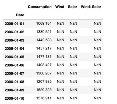
Then, make sure to transform the dates into datetime format in pandas :
df.index = pd.to_datetime(df.index)
Using the df.describe() function, we observe that there are almost half of the solar data points that are missing. This is because the series does not start at the same time.
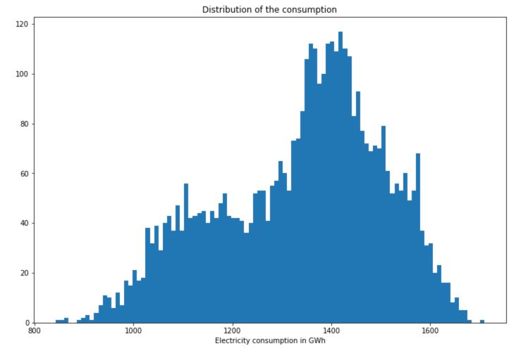
2. Distributions
We can now take a look at the distribution of the different variables we measured :
# Distribution of the consumption
plt.figure(figsize=(12,8))
plt.hist(df['Consumption'], bins=100)
plt.title("Distribution of the consumption")
plt.xlabel("Electricity consumption in GWh")
plt.show()
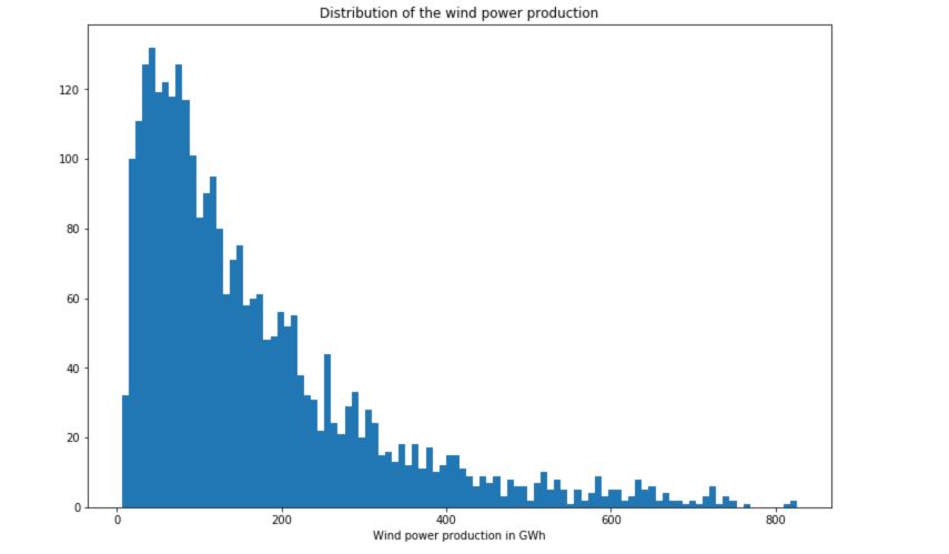
# Distribution of the wind power production
plt.figure(figsize=(12,8))
plt.hist(df['Wind'], bins=100)
plt.title("Distribution of the wind power production")
plt.xlabel("Wind power production in GWh")
plt.show()
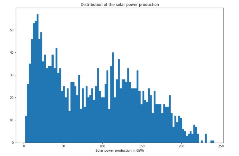
# Distribution of the solar power production
plt.figure(figsize=(12,8))
plt.hist(df['Solar'], bins=100)
plt.title("Distribution of the solar power production")
plt.xlabel("Solar power production in GWh")
plt.show()
3. Time Series
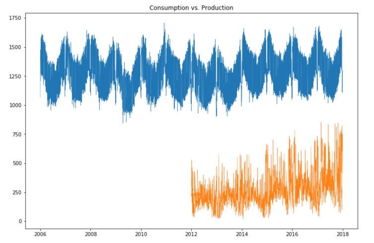
First of all, how does the overall production compare with the overall consumption?
plt.figure(figsize=(12,8))
plt.plot(df['Consumption'], linewidth = 0.5)
plt.plot(df['Wind+Solar'], linewidth = 0.5)
plt.title("Consumption vs. Production")
plt.show()
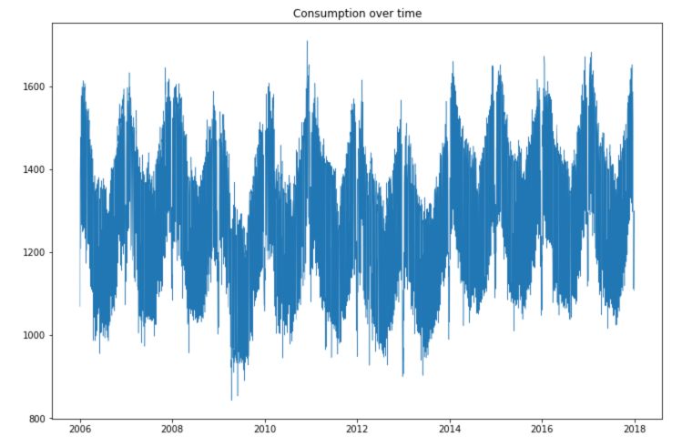
Let’s now take a look at the consumption over time :
plt.figure(figsize=(12,8))
plt.plot(df['Consumption'], linewidth = 0.5)
plt.title("Consumption over time")
plt.show()
plt.figure(figsize=(12,8))
plt.plot(df['Consumption'], linewidth = 0.5, linestyle = "None", marker='.')
plt.title("Consumption over time")
plt.show()

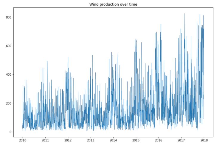
plt.figure(figsize=(12,8))
plt.plot(df['Wind'], linewidth = 0.5)
plt.title("Wind production over time")
plt.show()
plt.figure(figsize=(12,8))
plt.plot(df['Solar'], linewidth = 0.5)
plt.title("Solar production over time")
plt.show()
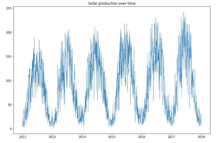
We observe large seasonal trends over time.
- The solar production is much smaller during winter times.
- The wind production is, however, larger during winter times, and the consumption as well.
- There is an increasing trend in the production of both solar and wind power over time.
- There is a large number of points in consumption located in the highest part of the time series, and some points lying under this curve.
4. Change scale
Let’s now change scale and analyze the data per year, month and week.
Yearly
plt.figure(figsize=(12,8))
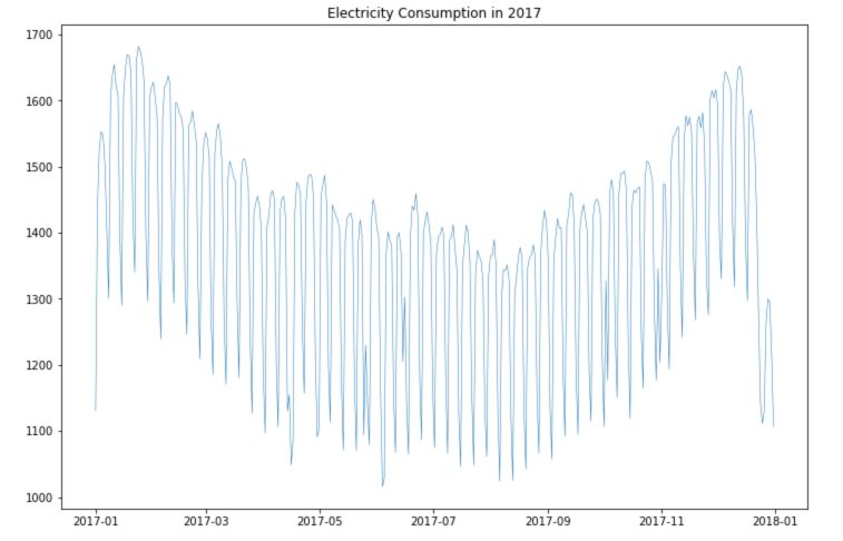
plt.plot(df.loc['2017-01':'2017-12']['Consumption'], linewidth = 0.5)
plt.title("Electricity Consumption in 2017")
plt.show()
plt.figure(figsize=(12,8))
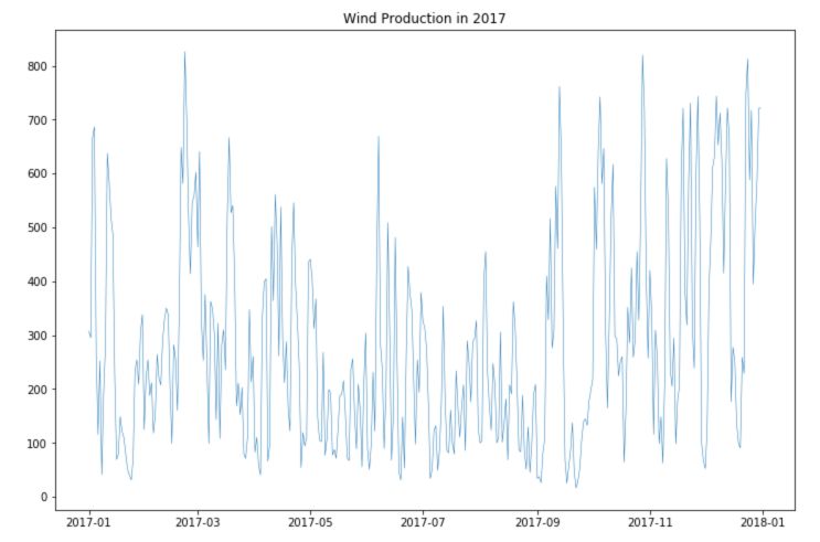
plt.plot(df.loc['2017-01':'2017-12']['Wind'], linewidth = 0.5)
plt.title("Wind Production in 2017")
plt.show()
plt.figure(figsize=(12,8))
plt.plot(df.loc['2017-01':'2017-12']['Solar'], linewidth = 0.5)
plt.title("Solar Production in 2017")
plt.show()
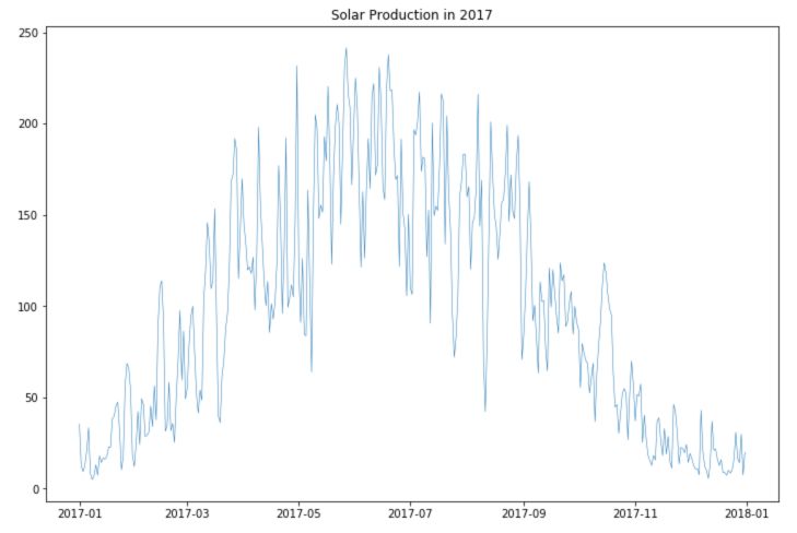
We observe better the seasonality for consumption and production.
Weekly
To understand the weekly trends, we can take a period of 3 weeks. I’ve added red line on Sundays, to better understand the pattern through the week :
plt.figure(figsize=(12,8))
plt.plot(df.loc['2017-12-09':'2017-12-31']['Consumption'], linewidth = 0.5)
plt.title("Electricity Consumption in December 2017")
plt.axvline("2017-12-10", c='r')
plt.axvline("2017-12-17", c='r')
plt.axvline("2017-12-24", c='r')
plt.show()
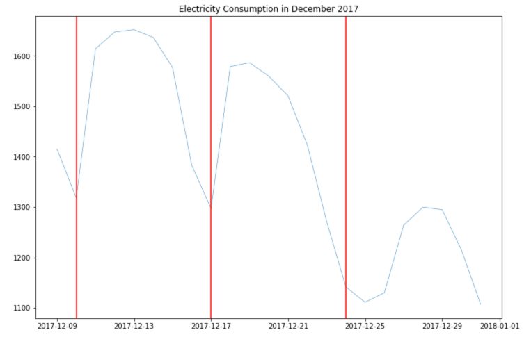
There seems to be a larger consumption and Tuesday, Wednesday and Thursday. The consumption is much lower on weekends.
There is no point in analyzing trends of production weekly since there is no correlation between the day of the week and the sun/wind. We do not have access to hourly consumption data, so we can’t dive deeper into this analysis.
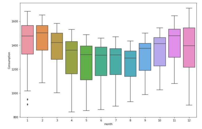
5. Box plots
So far, we explored the trends visually. Box plots are a nice way to present the trend information visually as well as the confidence intervals to validate our hypothesis. We must start by creating new columns for the year, month and day of the week.
df['year'] = df.index.year
df['month'] = df.index.month
df['day'] = df.index.weekday_name
We’ll take a look at the consumption :
plt.figure(figsize=(12,8))
sns.boxplot(data=df, x='year', y='Consumption')
plt.show()

plt.figure(figsize=(12,8))
sns.boxplot(data=df, x='month', y='Consumption')
plt.show()
plt.figure(figsize=(12,8))
sns.boxplot(data=df, x='day', y='Consumption')
plt.show()
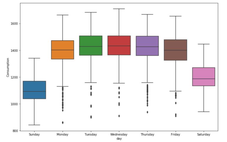
There is a significant effect of the day of the week over the consumption. The month also has a large effect.
6. Handling missing values
There are several ways to handle missing values. A pretty common way to do this is to use Forward Filling. This simply means that when there is a missing value, you take the previously known value and duplicate it. This is pretty much the best approximation we can make without any further information.
df = df.fillna(method='ffill')
We can also fill backward starting from the next value, using bfill.
Rolling Mean
The rolling mean of a time series produces a smoother version than the original series. How is this achieved?
Over a given window, for example here, a window of 7 days, we take the average of all the days within the window.
plt.figure(figsize=(12,8))
plt.plot(df.loc['2017-11':'2017-12']['Consumption'])
plt.axvline('2017-11-09', color = 'red')
plt.axvline('2017-11-16', color = 'red')
plt.show()
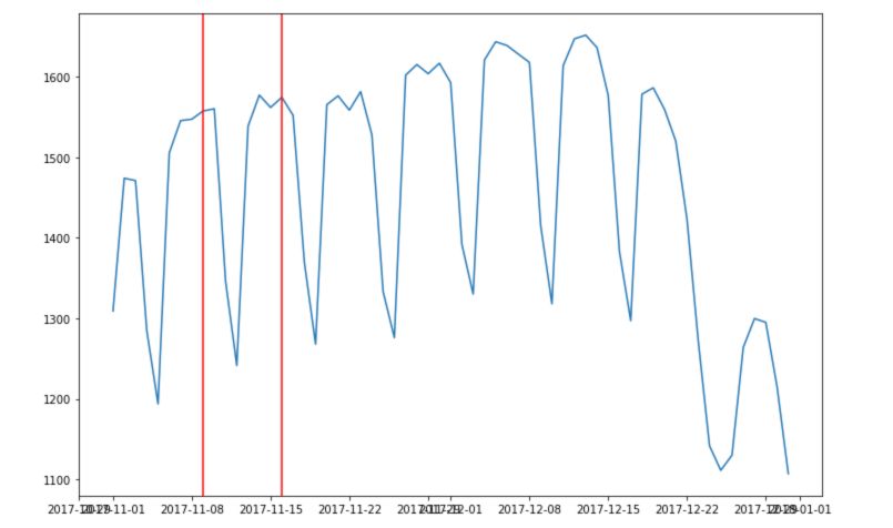
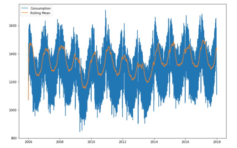
This overall allows a much smoother series :
plt.figure(figsize=(12,8))
plt.plot(df['Consumption'], label="Consumption")
plt.plot(df['Consumption'].rolling('90D').mean(), label="Rolling Mean")
plt.legend()
plt.show()
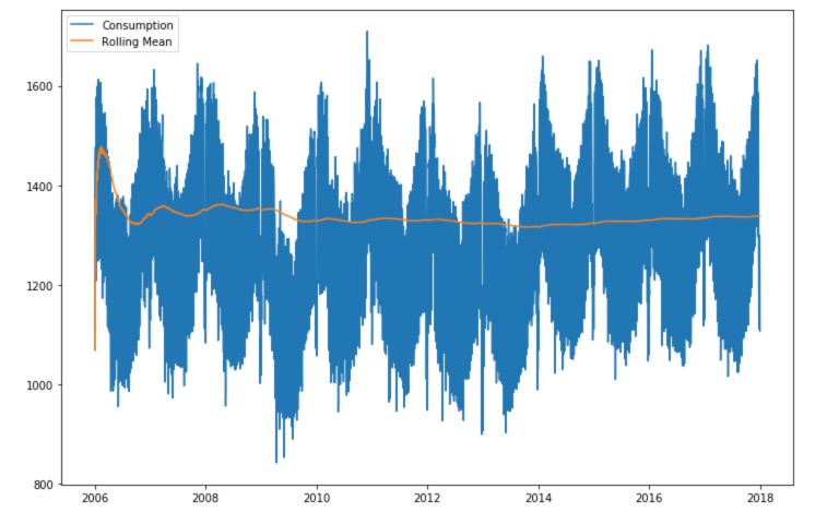
Instead of defining an average over a given number of observations within a window, we can take the mean of all the observations up to the given point. This is called expanding!
plt.figure(figsize=(12,8))
plt.plot(df['Consumption'], label="Consumption")
plt.plot(df['Consumption'].expanding().mean(), label="Rolling Mean")
plt.legend()
plt.show()
**Conclusion **: We have now covered the basics of time series exploration. In the next articles, we’ll cover trends, seasonality, stationarity, ergodicity and many other concepts.