
So far, we covered the main kind of graphs and the basics of graph analysis. We’ll now cover into more details the way we can “learn” in graphs.
For what comes next, open a Jupyter Notebook and import the following packages :
import numpy as np
import random
import networkx as nx
from IPython.display import Image
import matplotlib.pyplot as plt
If you have not already installed the networkx package, simply run :
pip install networkx
The following articles will be using the latest version 2.x of networkx. NetworkX is a Python package for the creation, manipulation, and study of the structure, dynamics, and functions of complex networks.
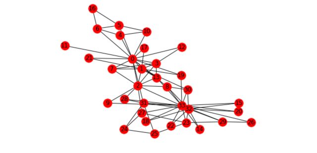
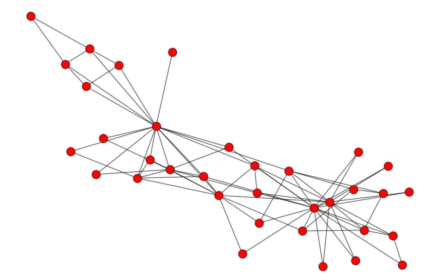
To illustrate the different concepts we’ll cover and how it applies to graphs we’ll take the Karate Club example. This graph is present in the networkx package. It represents the relations of members of a Karate Club. However, due to a disagreement of the founders of the club, the club has recently been split in two. We’ll try to illustrate this event with graphs.
First, load and plot the graph :
n=34
m = 78
G_karate = nx.karate_club_graph()

pos = nx.spring_layout(G_karate)
nx.draw(G_karate, cmap = plt.get_cmap('rainbow'), with_labels=True, pos=pos)
There are two main tasks in graph learning :
- Link prediction
- Node labeling
We’ll start with link prediction.
I. Link prediction
In Link Prediction, given a graph \(G\), we aim to predict new edges. Predictions are useful to predict future relations or missing edges when the graph is not fully observed for example.
In link prediction, we simply try to build a similarity measure between pairs of nodes and link the most similar (until we reach a threshold \(k\) for example). The question is now to identify the right similarity scores!
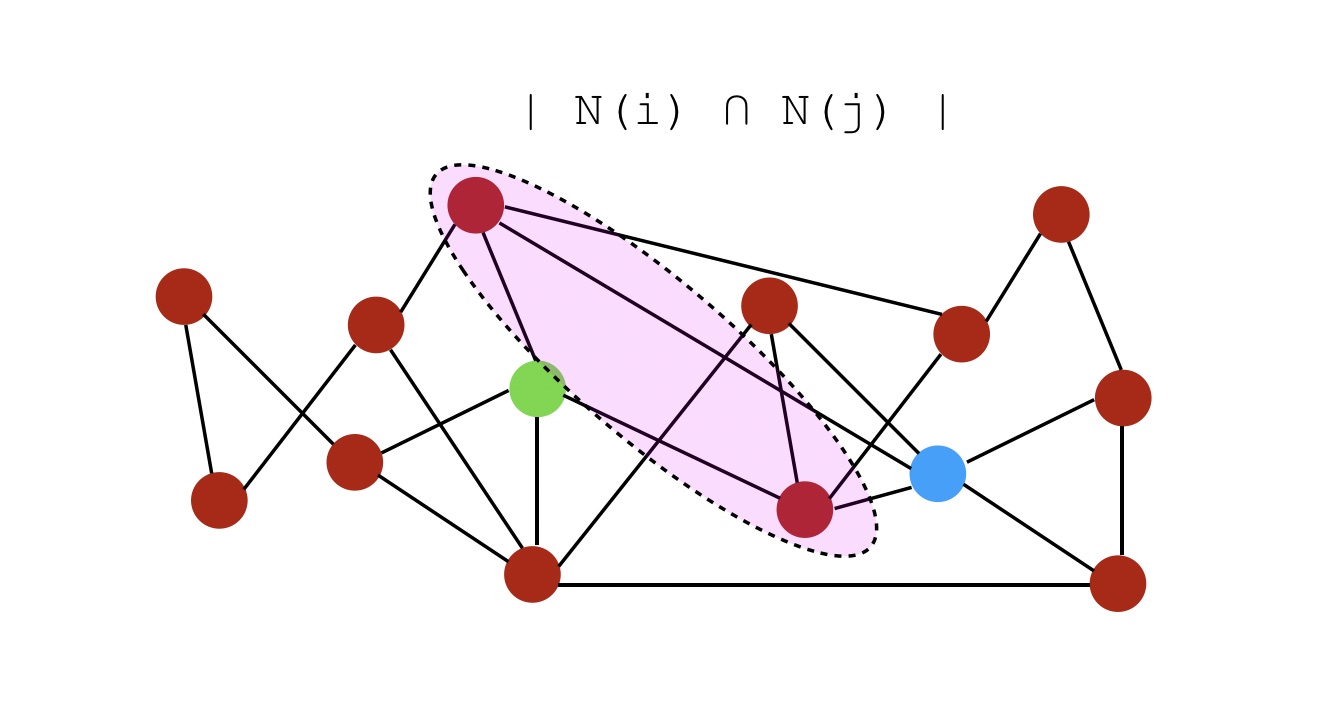
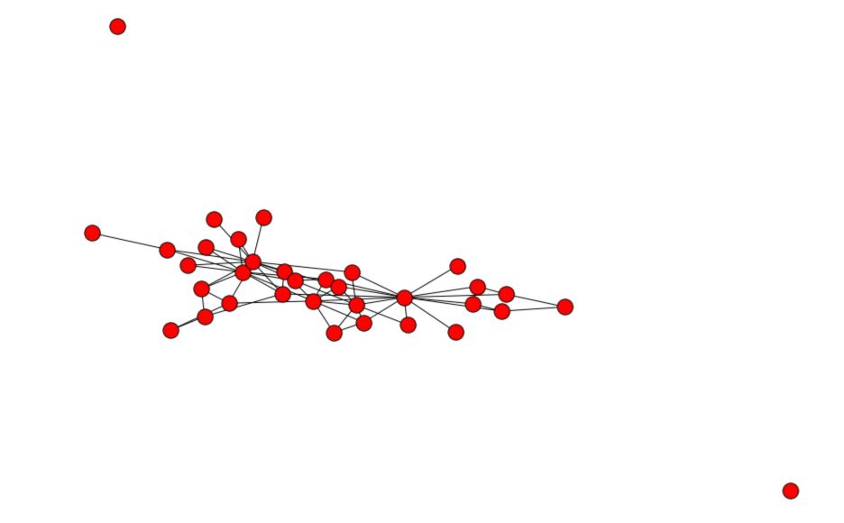
To illustrate the different similarity scores, let’s consider the following graph :
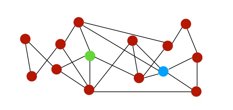
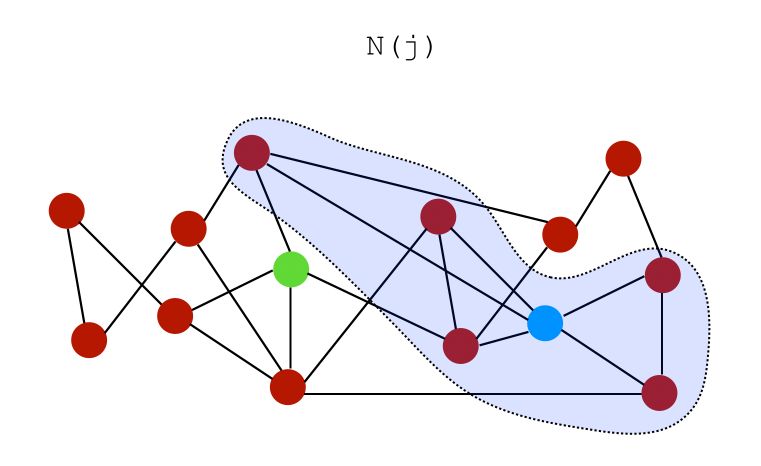
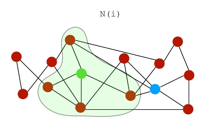
Let \(N(i)\) be a set of neighbors of node \(i\). On the graph above, the neighbors of both nodes \(i\) and \(j\) can be represented as :
We can build several similarity scores :
- Common Neighbors : \(S(i,j) = \mid N(i) \cap N(j) \mid\). In this example, the score would be simply 1.
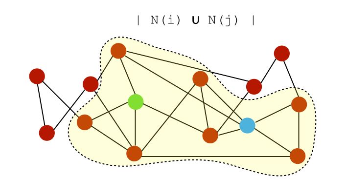
- Jaccard Coefficient : \(S(i,j) = \frac { \mid N(i) \cap N(j) \mid } { \mid N(i) \cup N(j) \mid }\). This is a normalized common neighbors version.
The intersection is the Common Neighbors, and the union is :
Therefore, the Jaccard Coefficient is given by the ratio :
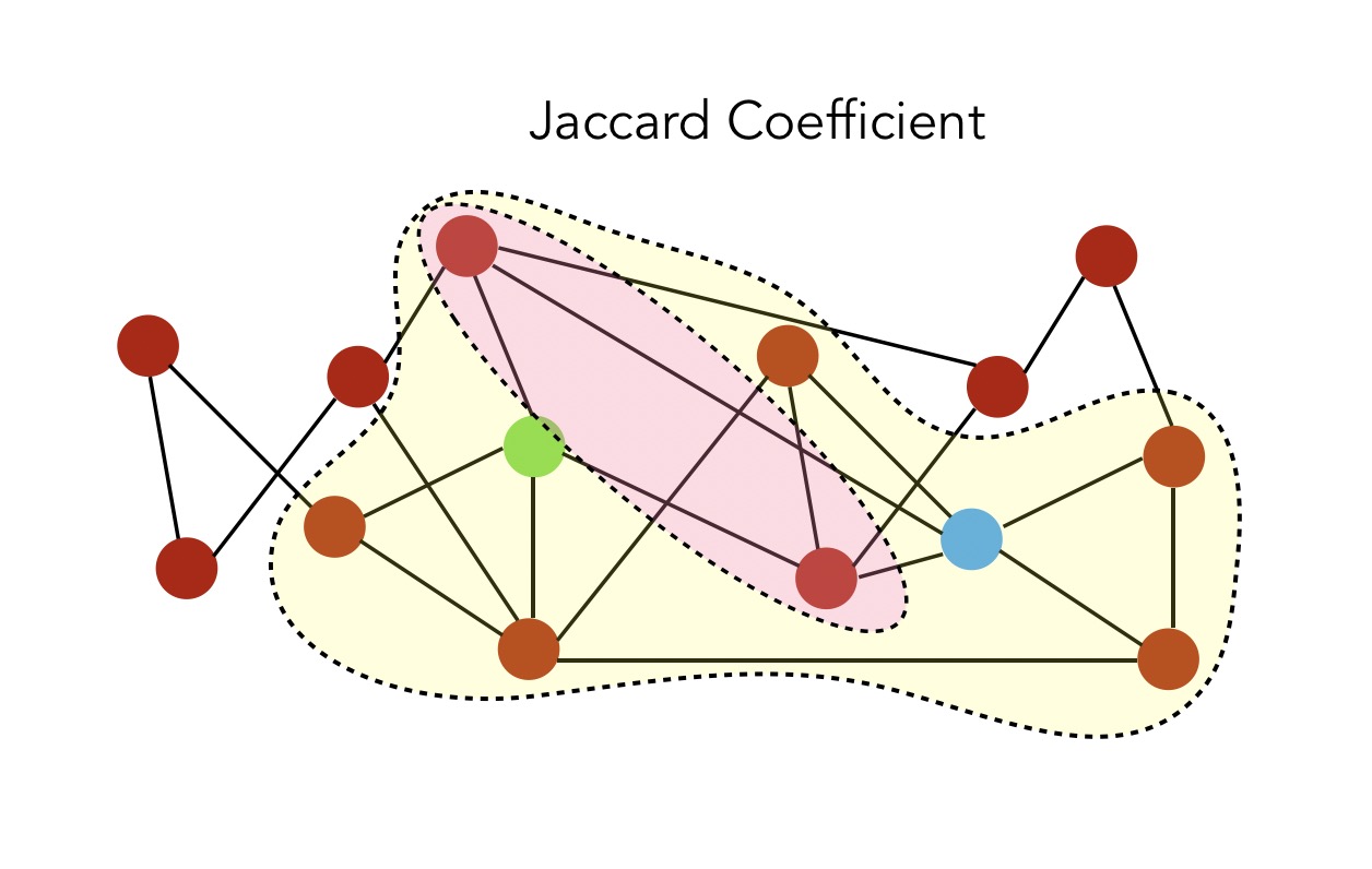
And the value is \(\frac {1} {6}\).
- Adamic-Adar index : \(S(i,j) = \sum_{k \in N(i)\cap N(j) } \frac {1} {\log \mid N(k) \mid}\) In other words, for each common neighbor of nodes \(i\) and \(j\), we add \(1\) divided by the total number of neighbors of that node. The concept is that common elements with very large neighborhoods are less significant when predicting a connection between two nodes compared to elements shared between a small number of nodes.
- Preferential attachment : \(S(i,j) = \mid N(i) \mid * \mid N(j) \mid\)
- We can also use community information when it is available.
How do we evaluate the link prediction? We must hide a subset of node pairs, and predict their links based on the rules defined above. We then evaluate the proportion of correct predictions for dense graphs, or use Area under the Curve criteria for Sparse graphs.
Let’s implement this in Python on our Karate graph!
First of all, print the information of the graph :
n = G_karate.number_of_nodes()
m = G_karate.number_of_edges()
print("Number of nodes : %d" % n)
print("Number of edges : %d" % m)
print("Number of connected components : %d" % nx.number_connected_components(G_karate))
Then, plot the graph itself :
plt.figure(figsize=(12,8))
nx.draw(G_karate)
plt.gca().collections[0].set_edgecolor("#000000")
Now, let’s remove some connections :
# Remove 20% of the edges
proportion_edges = 0.2
edge_subset = random.sample(G_karate.edges(), int(proportion_edges * G_karate.number_of_edges()))

# Create a copy of the graph and remove the edges
G_karate_train = G_karate.copy()
G_karate_train.remove_edges_from(edge_subset)
And plot the partially observed graph :
plt.figure(figsize=(12,8))
nx.draw(G_karate_train)
plt.gca().collections[0].set_edgecolor("#000000") # set node border color to black
You can print the number of edges we deleted and the number of edges remaining :
edge_subset_size = len(list(edge_subset))
print("Number of edges deleted : %d" % edge_subset_size)
print("Number of edges remaining : %d" % (m - edge_subset_size))
Number of edges deleted : 15
Number of edges remaining : 63
Jaccard Coefficient
# Make prediction using Jaccard Coefficient
pred_jaccard = list(nx.jaccard_coefficient(G_karate_train))
score_jaccard, label_jaccard = zip(*[(s, (u,v) in edge_subset) for (u,v,s) in pred_jaccard])
The prediction look like this, a first node, a second node and a jaccard score :
[(0, 32, 0.15),
(0, 33, 0.125),
(0, 3, 0.21428571428571427),
(0, 9, 0.0),
(0, 14, 0.0),
(0, 15, 0.0),
...
Then, compute the score :
# Compute the ROC AUC Score
fpr_jaccard, tpr_jaccard, _ = roc_curve(label_jaccard, score_jaccard)
auc_jaccard = roc_auc_score(label_jaccard, score_jaccard)
Adamic-Adar
We can now repeat this for the Adamic-Adar Index :
# Prediction using Adamic Adar
pred_adamic = list(nx.adamic_adar_index(G_karate_train))
score_adamic, label_adamic = zip(*[(s, (u,v) in edge_subset) for (u,v,s) in pred_adamic])

# Compute the ROC AUC Score
fpr_adamic, tpr_adamic, _ = roc_curve(label_adamic, score_adamic)
auc_adamic = roc_auc_score(label_adamic, score_adamic)
Preferential Attachment
And for the preferential attachment score :
# Compute the Preferential Attachment
pred_pref = list(nx.preferential_attachment(G_karate_train))
score_pref, label_pref = zip(*[(s, (u,v) in edge_subset) for (u,v,s) in pred_pref])

fpr_pref, tpr_pref, _ = roc_curve(label_pref, score_pref)
auc_pref = roc_auc_score(label_pref, score_pref)
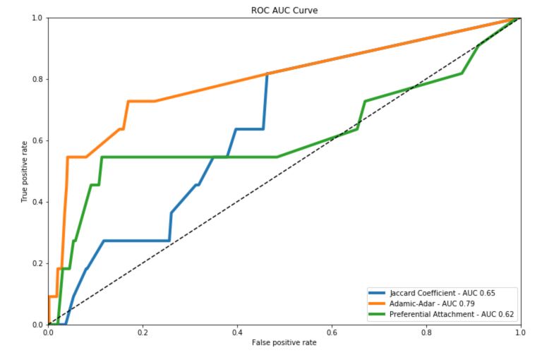
Plot the ROC AUC Curve
The Adamic-Adar seems to outperform the other criteria on our problem :
We covered the most common similarity scores for link prediction. We’ll now cover into more details the node labeling algorithms.
II. Node Labeling
Given a graph where some nodes are not labeled, we want to predict their labels. This is in some sense a semi-supervised learning problem.
One common way to deal with such problems is to assume that there is a certain smoothness on the graph. The Smoothness assumption states that points connected via a path through high-density regions on the data are likely to have similar labels. This is the main hypothesis behind the Label Propagation Algorithm.
The Label Propagation Algorithm (LPA) is a fast algorithm for finding communities in a graph using network structure alone as its guide, without any predefined objective function or prior information about the communities.
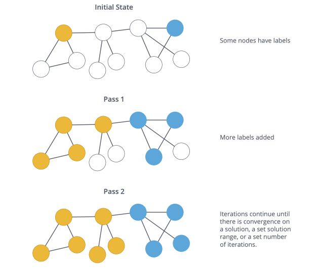
A single label can quickly become dominant in a densely connected group of nodes, but it will have trouble crossing a sparsely connected region.
How does the semi-supervised label propagation work?
First, we have some data : \(x_1, ..., x_l, x_{l+1}, ..., x_n \in R^p\), and labels for the first \(l\) points : \(y_1, ..., y_l \in 1...C\)
We define the initial label matrix \(Y \in R^{n \times C}\) such that \(Y_{ij} = 1\) if \(x_i\) has label \(y_i = j\) and \(0\) otherwise.
The algorithm will generate a prediction matrix \(F \in R^{n \times C}\) which we’ll detail under. Then, we predict the label of a node by finding the label that is the most likely :
\[\hat{Y_i} = argmax_j F_{i,j}\]What is the prediction matrix \(F\) ?
The prediction matrix is a matrix \(F^{\star}\) that minimizes both smoothness and accuracy criteria. Therefore, there is a tradeoff to make between the smoothness and the accuracy of our result.
The problem expression is quite complex, so I won’t go into details. However, the solution is given by :
\(F^{\star} = ( (1-\alpha)I + L_{sym})^{-1} Y\) where :
- the parameter \(\alpha = \frac {1} {1+\mu}\)
- the labels are given by \(Y\)
- and \(L_{sym}\) is the normalized Laplacian matrix of the graph
If you’d like to go further on this topic, check the notions of smoothness of a graph function and manifold regularization.
Alright, now, how do we implement this in Python?
To have additional (binary) features that we’ll use as labels, we need to work with some real-world data from Facebook! You can download the data right here
Put them in a folder called “facebook” in your repository.
G_fb = nx.read_edgelist("facebook/414.edges")
n = G_fb.number_of_nodes()
m = G_fb.number_of_edges()

print("Number of nodes: %d" % n)
print("Number of edges: %d" % m)
print("Number of connected components: %d" % nx.number_connected_components(G_fb))
Number of nodes: 150
Number of edges: 1693
Number of connected components: 2
We have a sample graph of 150 nodes, for 1693 edges. There are 2 connected components, which means that there is a part of the graph that is detached from the rest.
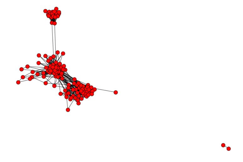
Let’s now plot the graph :
mapping=dict(zip(G_fb.nodes(), range(n)))
nx.relabel_nodes(G_fb, mapping, copy=False)
pos = nx.spring_layout(G_fb)

plt.figure(figsize=(12,8))
nx.draw(G_fb, node_size=200, pos=pos)
plt.gca().collections[0].set_edgecolor("#000000")
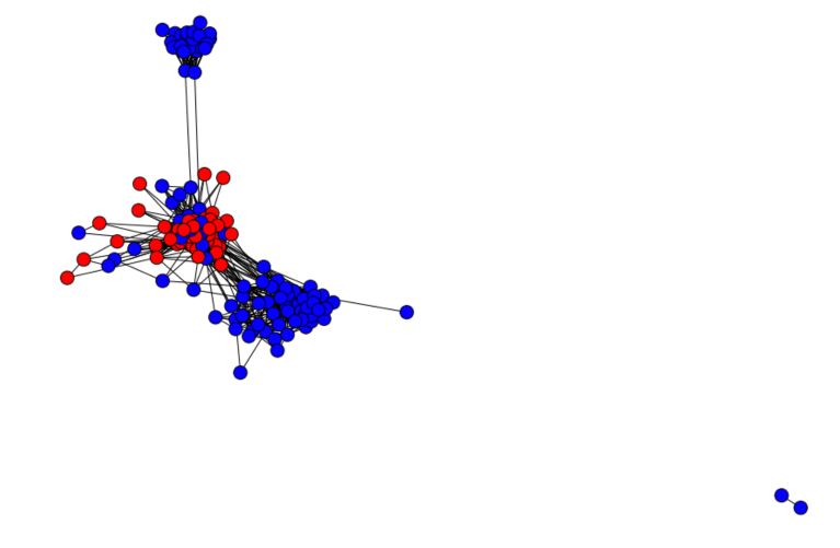
The graph comes with some features. Among the features available, we are going to use feature 43, that describes whether someone attended a given school or not. We have only 2 labels (1, in red, if attended and -1, in blue, otherwise).
with open('facebook/414.featnames') as f:
    for i, l in enumerate(f):
        pass

n_feat = i+1

features = np.zeros((n, n_feat))
f = open('facebook/414.feat', 'r')

for line in f:
    if line.split()[0] in mapping:
        node_id = mapping[line.split()[0]]
            features[node_id, :] = list(map(int, line.split()[1:]))

features = 2*features-1
feat_id = 43
labels = features[:, feat_id]

plt.figure(figsize=(12,8))
nx.draw(G_fb, cmap = plt.get_cmap('bwr'), nodelist=range(n), node_color = labels, node_size=200, pos=pos)
plt.gca().collections[0].set_edgecolor("#000000")
plt.show()
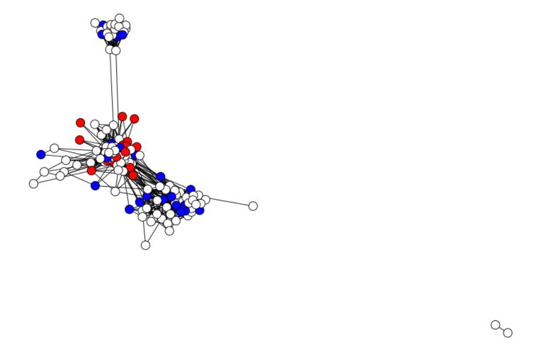
This attribute is rather smooth on the graph, so propagation should work pretty well. To illustrate how node labeling works, we’ll now delete some of the node labels. We’ll keep only 30% of the nodes :
random.seed(5)
proportion_nodes = 0.3
labeled_nodes = random.sample(G_fb.nodes(), int(proportion_nodes * G_fb.number_of_nodes()))

known_labels = np.zeros(n)
known_labels[labeled_nodes] = labels[labeled_nodes]

plt.figure(figsize=(12,8))
nx.draw(G_fb, cmap = plt.get_cmap('bwr'), nodelist=range(n), node_color = known_labels, node_size=200, pos=pos)
plt.gca().collections[0].set_edgecolor("#000000") # set node border color to black
plt.show()
Alright, we are now ready to apply label propagation!
alpha = 0.7
L_sym = nx.normalized_laplacian_matrix(G_fb)

Y = np.zeros((n,2))
Y[known_labels==-1, 0] = 1
Y[known_labels==1, 1] = 1
I = np.identity(n)

# Create the F-pred matrix
F_pred = np.linalg.inv(I*(1-alpha) + L_sym) * Y
# Identify the prediction as the argmax
pred = np.array(np.argmax(F_pred, axis=1)*2-1).flatten()
# Compute the accuracy score
succ_rate = accuracy_score(labels, pred)
And plot the result :
plt.figure(figsize=(18, 6))
f, axarr = plt.subplots(1, 2, num=1)

# Plot true values
plt.sca(axarr[0])
nx.draw(G_fb, cmap = plt.get_cmap('bwr'), nodelist=range(n), node_color = labels, node_size=200, pos=pos)
axarr[0].set_title('True labels', size=16)
plt.gca().collections[0].set_edgecolor("#000000")

# Plot predicted values
plt.sca(axarr[1])
nx.draw(G_fb, cmap = plt.get_cmap('bwr'), nodelist=range(n), node_color = pred, node_size=200, pos=pos)
axarr[1].set_title('Predicted labels (Success Rate: %.2f)' % succ_rate, size=16)
plt.gca().collections[0].set_edgecolor("#000000")
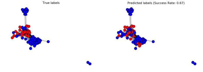
That’s it, we have our final prediction!
Conclusion : I hope that this article on graph learning was helpful. Don’t hesitate to drop a comment if you have any question.
Sources :
- A Comprehensive Guide to Graph Algorithms in Neo4j
- Networkx Documentation