
Let’s now dig deeper into graph analysis! What are the main kinds of graphs? What are their properties?
Introduction
For what comes next, open a Jupyter Notebook and import the following packages :
import numpy as np
import random
import networkx as nx
from IPython.display import Image
import matplotlib.pyplot as plt
If you have not already installed the networkx package, simply run :
pip install networkx
The following articles will be using the latest version 2.x of networkx. NetworkX is a Python package for the creation, manipulation, and study of the structure, dynamics, and functions of complex networks.
We can analyze a graph at different scales :
- using the global properties of the network
- using communities and clusters
- or by looking at individual nodes
The main descriptive measures we’ll explore will be :
- the degree distribution
- the clustering coefficient
- the “small world” phenomena
- the centrality of a node
- the diameter of the graph …
We’ll now cover the most common types of graph models :
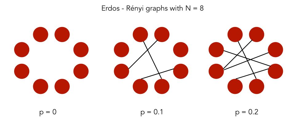
Erdos-Rényi model
Definition
In an Erdos-Rényi model, we build a random graph model with \(n\) nodes. The graph is generated by drawing an edge between a pair of nodes \((i,j)\) independently with probability \(p\). We, therefore, have 2 parameters: \(n\) the number of nodes and \(p\)
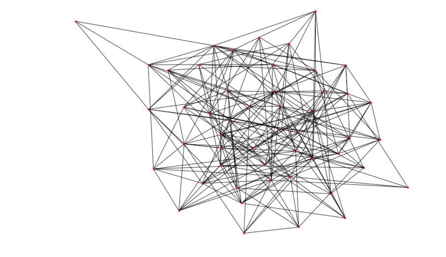
In Python, the networkx package has a built-in function to generate Erdos-Rényi graphs.
# Generate the graph
n = 50
p = 0.2
G_erdos = nx.erdos_renyi_graph(n,p, seed =100)

# Plot the graph
plt.figure(figsize=(12,8))
nx.draw(G_erdos, node_size=10)
You’ll get a result pretty similar to this one :
Degree distribution
Let \(p_k\) the probability that a randomly selected node has a degree \(k\). Due to the random way the graphs are built, the distribution of the degrees of the graph is binomial :
\[p_k = {n-1 \choose k} p^k (1-p)^{n-1-k}\]The distribution of the number of degrees per node should be close to the mean. The probability of high nodes decreases exponentially.
degree_freq = np.array(nx.degree_histogram(G_erdos)).astype('float')

plt.figure(figsize=(12, 8))
plt.stem(degree_freq)
plt.ylabel("Frequence")
plt.xlabel("Degree")
plt.show()
To visualize the distribution, I have increased \(n\) to 200.
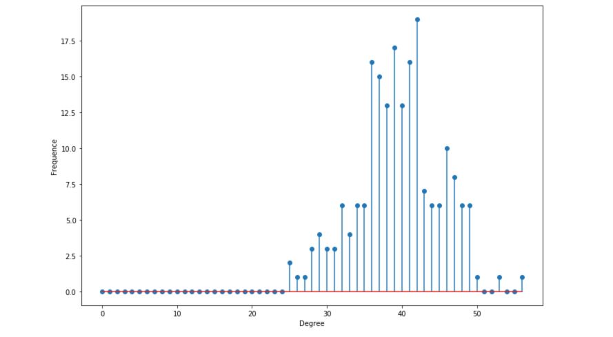
Descriptive statistics
- The average degree is given by \(n \times p\). With \(p = 0.2\) and \(n = 200\), we are centered around 40.
- The degree expectation is given by \((n-1) \times p\)
- The maximum degree is concentrated around the average
# Get the list of the degrees
degree_sequence_erdos = list(G_erdos.degree())

nb_nodes = n
nb_arr = len(G_erdos.edges())

avg_degree = np.mean(np.array(degree_sequence_erdos)[:,1])
med_degree = np.median(np.array(degree_sequence_erdos)[:,1])

max_degree = max(np.array(degree_sequence_erdos)[:,1])
min_degree = np.min(np.array(degree_sequence_erdos)[:,1])

esp_degree = (n-1)*p

print("Number of nodes : " + str(nb_nodes))
print("Number of edges : " + str(nb_arr))

print("Maximum degree : " + str(max_degree))
print("Minimum degree : " + str(min_degree))

print("Average degree : " + str(avg_degree))
print("Expected degree : " + str(esp_degree))
print("Median degree : " + str(med_degree))
This should give you something similar to :
Number of nodes: 200
Number of edges: 3949
Maximum degree: 56
Minimum degree: 25
Average degree: 39.49
Expected degree: 39.800000000000004
Median degree: 39.5
The average and the expected degrees are close since there is only a small factor between the two.
Barabasi-Albert model
Definition
In a Barabasi-Albert model, we build a random graph model with \(n\) nodes. The graph is generated by the following algorithm :
- Step 1: With a probability \(p\), move to the second step. Else, move to the third step.
- Step 2: Connect a new node to existing nodes chosen uniformly at random
- Step 3: Connect the new node to \(n\) existing nodes with a probability proportional to their degree
Such a graph aims to model preferential attachment, which is often observed in real networks.
In Python, the networkx package has also a built-in function to generate Barabasi-Albert graphs.
# Generate the graph
n = 150
m = 3
G_barabasi = nx.barabasi_albert_graph(n,m)

# Plot the graph
plt.figure(figsize=(12,8))
nx.draw(G_barabasi, node_size=10)
You’ll get a result pretty similar to this one :
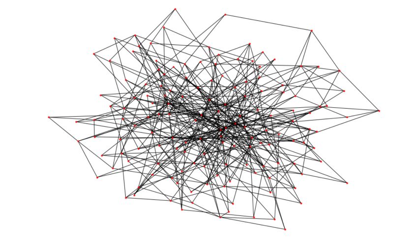
You can easily notice how some nodes appear to have a much larger degree than others now!
Degree distribution
Let \(p_k\) the probability that a randomly selected node has a degree \(k\). The degree distribution follows a power law :
\[p_k \propto k^{-\alpha}\]The distribution is now heavy-tailed. There is a large number of nodes that have a small degree, but a significant number of nodes have a high degree.
degree_freq = np.array(nx.degree_histogram(G_barabasi)).astype('float')

plt.figure(figsize=(12, 8))
plt.stem(degree_freq)
plt.ylabel("Frequence")
plt.xlabel("Degree")
plt.show()
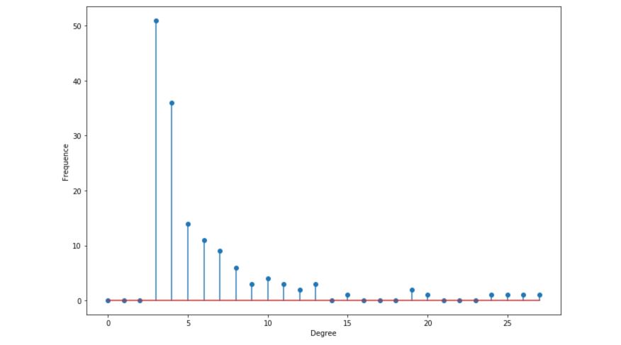
The distribution is said to be scale-free, in the sense that the average degree is not informative.
Descriptive statistics
- The average degree is constant if \(\alpha ≤ 2\), else, it diverges
- The maximum degree is \(O(n^{ \frac {1} { \alpha -1}})\)
# Get the list of the degrees
degree_sequence_erdos = list(G_erdos.degree())

nb_nodes = n
nb_arr = len(G_erdos.edges())

avg_degree = np.mean(np.array(degree_sequence_erdos)[:,1])
med_degree = np.median(np.array(degree_sequence_erdos)[:,1])

max_degree = max(np.array(degree_sequence_erdos)[:,1])
min_degree = np.min(np.array(degree_sequence_erdos)[:,1])

esp_degree = (n-1)*p

print("Number of nodes : " + str(nb_nodes))
print("Number of edges : " + str(nb_arr))

print("Maximum degree : " + str(max_degree))
print("Minimum degree : " + str(min_degree))

print("Average degree : " + str(avg_degree))
print("Expected degree : " + str(esp_degree))
print("Median degree : " + str(med_degree))
This should give you something similar to :
Number of nodes: 200
Number of edges: 3949
Maximum degree: 56
Minimum degree: 25
Average degree: 39.49
Expected degree: 39.800000000000004
Median degree: 39.5
The average and the expected degrees are close since there is only a small factor between the two.
In the next article, we’ll cover the main Graph Algorithms used for fraud detection or in a social network for example.
Conclusion : I hope that this article introduced clearly the basis of graphs analysis and that it does now seem clear to you. Don’t hesitate to drop a comment if you have any question.