
Landscape of visual recommendation
Visualization is a great way to enrich data exploration and analysis. Visual Recommendation systems aim to suggest automatically visualizations of a dataset.
Think about it… How can you automatically create a good visualization? This is a hard question since there are thousands of ways to display information from a data set. The user could want to display specific columns, with a specific kind of graph, specific colors, etc.
There are several ways to create graphs automatically :
- rule-based methods, which typically requires a lot of tuning
- ML-based systems learn the relationship between training data and the visualizations
We will focus on the latter. Viz-ML is one of the most recent evolutions in ML-based systems, and proposes a Neural Network-based approach trained on Plotly’s Community feed, a set of more than 200Go of data that map data tables and visualizations. This article will summarize the initial 13 pages of paper. The code of the paper is available on GitHub.
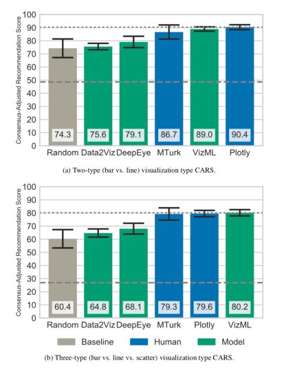
VizML reached a visual satisfaction degree (measured on Amazon Mechanical Turk) similar to the one reached by Plotly’s users and outperforms other methods.
What is visualization?
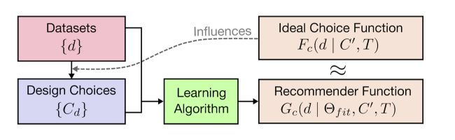
Building a visualization means making a set of design choices among possible choices. We make choices among \(C = \{ c \}\) designs, where each parameter \(c\) can take a certain number of values. Then, the number of total (possible) combinations is : \(c_1 \times c_2 \times ... \times c_k\) where \(c_1\) is the number of possible choices for the first parameter. We measure the effectiveness of visualization by efficiency, accuracy, memorability, engagement, etc. given contextual factors: data, tasks, audience, medium…
The user aims to maximize the effectiveness given the constraints :
\[C_max = arg max_C Eff( C \mid d, T)\]The output of a good visual recommendation system should be to suggest a subset of design choices \(C_{rec} \subseteq C\). The authors defined an objective function that maximizes the likelihood of observing the training output \(C_d\). The authors try to approximate the best solution with a neural network model \(G_C\).
The overall pipeline looks like this :
How does VizML work?
The data
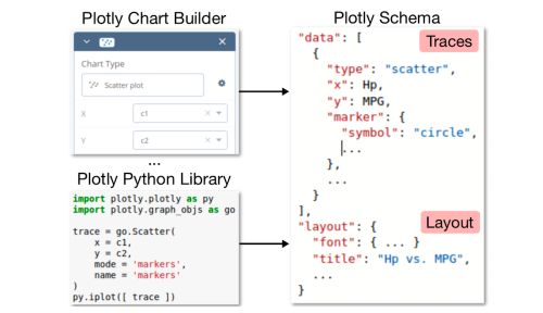
The data was collected using the Community Feed of Plotly. The data come as JSON files. data contains the source data, specification contains the traces, and layout defines display configuration.
The training data is roughly made of 2 million unique visualizations. 95% of the datasets are made of less than 25 columns.
Feature extraction
At that point, we still need to extract features from the JSON files before training any model. The idea is to teach the algorithm which columns are relevant for plotting purposes. We need to extract features from these columns to build a training dataset.
The features created refer to :
- either a single column. There are 81 single-column features
- either pair of columns. There are 30 pair features
The 81 features extracted concern either :
- The Dimension: number of values
- The type of data: categorical, string, integer, temporal…
- The values: mean, median, skewness, entropy…
- The column names: length of the name, number of words, contains…
The 30 pairwise columns concern either :
- The values (correlation, Kolmogorov-Smirnov test, ANOVA…)
- The column names: edit distances (Levenshtein), shared words…
The authors created 841 dataset-level features by aggregating these single and pairwise-column features using 16 aggregation functions.
Design extraction
The last data pre-processing step is to extract the design type from the JSON file. The idea was to extract an analyst’s design choices by parsing these files, and extracting encoding-level design choices such as mark type (scatter, line, bar) and X or Y column encoding,
Some additional cleaning is then done to remove duplicates of datasets and identify a final corpus of 199’000 datasets and 287’000 columns.
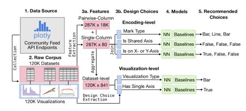
Prediction tasks
To get a good set of basic models, naive Bayes, K-Nearest Neighbors, and Logistic Regressions were used as baselines. The model tuned in VizML is a fully-connected feedforward neural network (NN). The network had 3 hidden layers, each consisting of 1,000 neurons with ReLU activation functions.
The accuracy was the chosen metric. The neural network almost systematically outperforms other models.
Model interpretability
To interpret the model and justify the feature extraction, we can compute the feature importances :
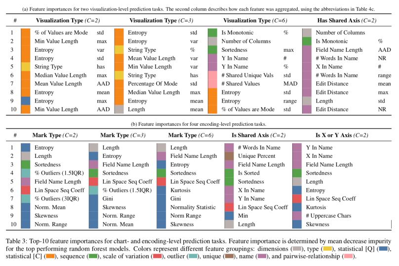
Key messages :
- Dimensionality (grey): the length of a column is the second most important feature for predicting whether that column is visualized in a line or a bar trace.
- Column types (yellow): consistently important for each prediction task. For example, whether a dataset has a string column is the fifth most important feature for determining whether that dataset is visualized as a bar or a line chart.
- Statistical features (blue and orange): Gini, entropy, skewness, and kurtosis are much more important than lower moments such as mean and variance.
- Orderedness (green): Sortedness is defined as the element-wise correlation between the sorted and unsorted values of a column. It appears to be quite important since users might have pre-sorted target columns in Plotly.
- The scale of variation (red): the linear or logarithmic space sequence coefficients is also important.
Results
To measure the performance of the model, participants were recruited through Amazon Mechanical Turk. The outcomes are encouraging since VizML performs as well as Plotly’s users on the chosen metric.
*Conclusion *: This recent paper offers great perspectives in the field of Visual Recommendation. In the original paper, the authors also suggest a series of future research directions.