
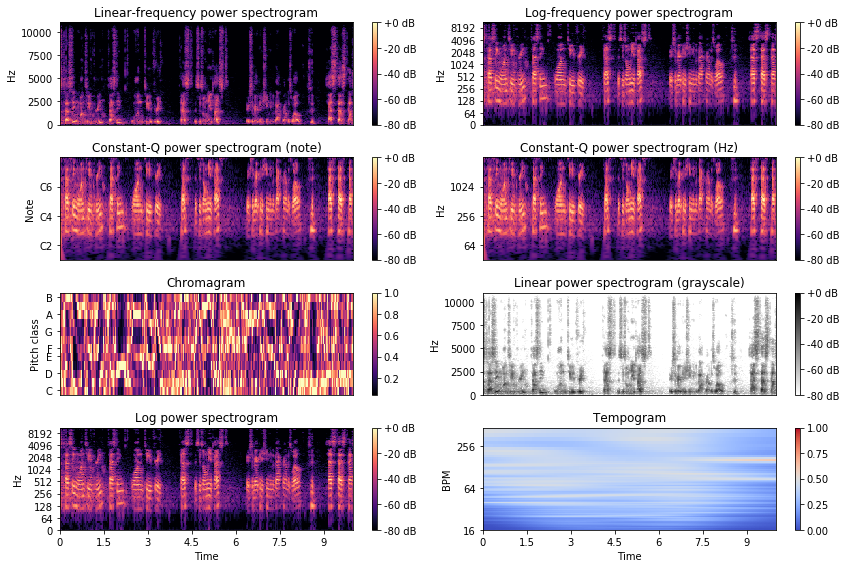
In this article, we’ll explore visualization techniques for signal which allow us to derive some additional insights from the data.
Spectrogram
Spectrograms offer a powerful representation of the data. It plots over the time, for a given range of frequencies, the power (dB) of a signal. This allows us to spot periodic patterns over time, and regions of activity.
Spectrograms are used in state-of-the-art sound classification algorithms to turn signals into images and apply CNNs on top on those images.
There are several types of spectrograms to plot.
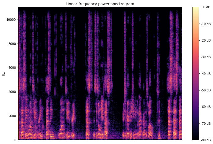
Linear-frequency power spectrogram
A linear-frequency power spectrogram represents the time on the x-axis, the frequency in Hz on a linear scale on the y-axis, and the power in dB.
import librosa

y, sr = librosa.load(filename)
D = librosa.amplitude_to_db(librosa.stft(y), ref=np.max)

plt.figure(figsize=(12,8))
librosa.display.specshow(D, y_axis='linear')
plt.colorbar(format='%+2.0f dB')
plt.title('Linear-frequency power spectrogram')
plt.show()
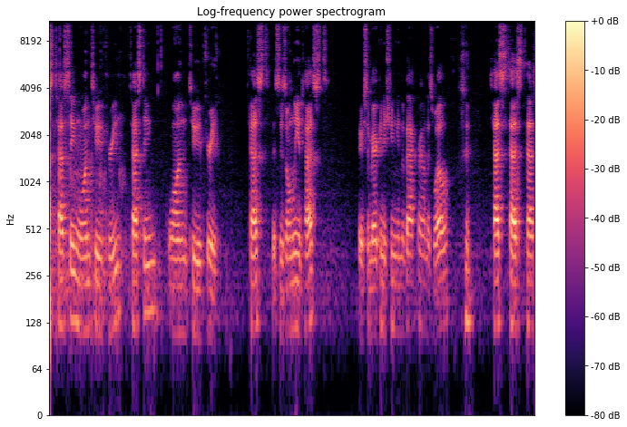
Log-frequency power spectrogram
This spectrogram presents the same information except for a logarithmic scale on the y-axis for the frequencies. Sometimes, as in our case, it’s a better scale if most of the information is located on lower frequencies and some noise are at high frequencies.
plt.figure(figsize=(12,8))
librosa.display.specshow(D, y_axis='log')
plt.colorbar(format='%+2.0f dB')
plt.title('Log-frequency power spectrogram')
plt.show()
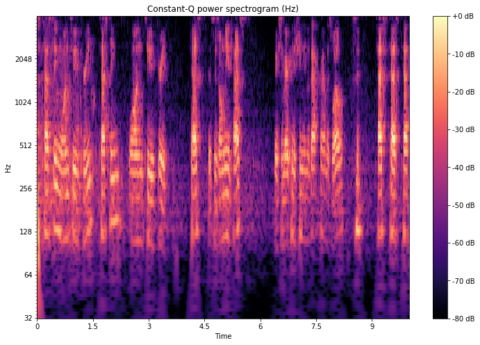
Constant-Q power spectrogram
Unlike the Fourier transform, but similar to the mel scale, the constant-Q transform uses a logarithmically spaced frequency axis.
CQT = librosa.amplitude_to_db(librosa.cqt(y, sr=sr), ref=np.max)
plt.figure(figsize=(12,8))
librosa.display.specshow(CQT, x_axis='time', y_axis='cqt_hz')
plt.colorbar(format='%+2.0f dB')
plt.title('Constant-Q power spectrogram (Hz)')
plt.show()
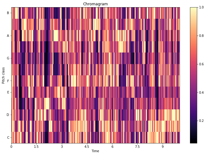
Chromagram
Chromagram display the intensity of each pitch \(C, C♯, D, D♯, E , F, F♯, G, G♯, A, A♯, B\) for each time interval. One main property of chroma features is that they capture harmonic and melodic characteristics of music, while being robust to changes in timbre and instrumentation.
C = librosa.feature.chroma_cqt(y=y, sr=sr)
plt.figure(figsize=(12,8))
librosa.display.specshow(C, x_axis='time', y_axis='chroma')
plt.colorbar()
plt.title('Chromagram')
plt.show()
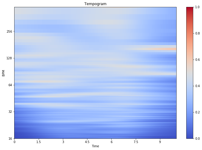
Tempogram
The tempo, measured in Beats Per Minute (BPM) measures the rate of the musical beat. The tempogram is a feature matrix which indicates the prevalence of certain tempi at each moment in time.
plt.figure(figsize=(12,8))
Tgram = librosa.feature.tempogram(y=y, sr=sr)
librosa.display.specshow(Tgram, x_axis='time', y_axis='tempo')
plt.colorbar()
plt.title('Tempogram')
plt.show()
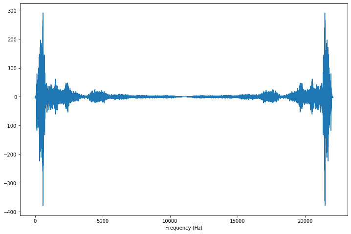
Spectrum
The spectrum of a discrete signal is computed using the fast Fourier transform (FFT) and displays the mangitude (or the energy) at each frequence within a signal.
import scipy

X = scipy.fft(y)
f = np.linspace(0, sr, len(X))
plt.figure(figsize=(12, 8))
plt.plot(f, X)
plt.xlabel('Frequency (Hz)')
plt.show()
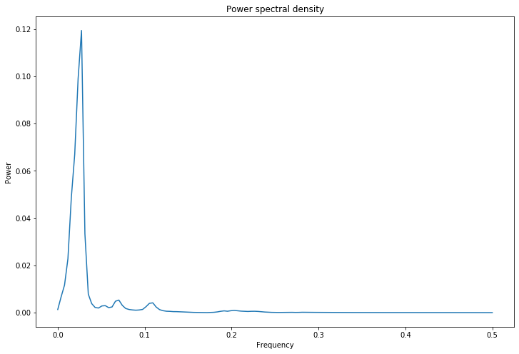
Power Spectral Density
The power spectrum of a signal describes the distribution of power into frequency components composing that signal.
freqs, psd = signal.welch(y)

plt.figure(figsize=(12, 8))
plt.semilogx(freqs, psd)
plt.title('Power spectral density')
plt.xlabel('Frequency')
plt.ylabel('Power')
plt.show()
Conclusion : I hope that you enjoyed this article. These type of plots are nowadays used as images to classify sounds by CNNs.