
In previous blog posts “Complexity vs. explainability” and “Interpretability and explainability (1/2)”, we highlighted the tradeoff between increasing the model’s complexity and loosing explainability, and the importance of interpretable models. In this article, we will finish the discussion and cover the notion of explainability in machine learning.
As previously, we will use the UCI Machine learning repository Breast Cancer data set. It is also available on Kaggle. Features are computed from a digitized image of a fine needle aspirate (FNA) of a breast mass. They describe characteristics of the cell nuclei present in the image. There are 30 features, including the radius of the tumor, the texture, the perimeter… Our task will be to perform a binary classification of the tumor, that is either malignant (M) or benign (B).
Start off by importing the packages :
# Handle data and plot
import pandas as pd
import numpy as np
import matplotlib.pyplot as plt
import seaborn as sns

# Interpretable models
from sklearn.model_selection import train_test_split
from sklearn.metrics import r2_score
from sklearn.metrics import accuracy_score
import statsmodels.api as sm
from sklearn.linear_model import LogisticRegression
from sklearn.tree import DecisionTreeClassifier
from sklearn.tree import export_graphviz
import graphviz

# Explainable models
from sklearn.ensemble import GradientBoostingRegressor
from sklearn.ensemble import RandomForestClassifier
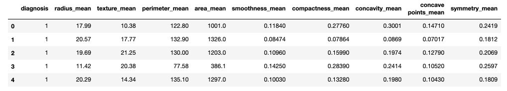
Then, read the data and apply a simply numeric transformation of the label (“M” or “B”).
df = pd.read_csv('data.csv').drop(['id', 'Unnamed: 32'], axis=1)

def to_category(diag):
if diag == "M" :
return 1
else :
return 0

df['diagnosis'] = df['diagnosis'].apply(lambda x : to_category(x))
df.head()
X = df.drop(['diagnosis'], axis=1)
y = df['diagnosis']
X_train, X_test, y_train, y_test = train_test_split(X, y, test_size=0.2)
Model explainability
If we are not constrained to interpretable models and need higher performance, we tend to use black box models such as XGBoost for example. For various reasons we might want to provide an explanation of the outcome and the internal mechanics of the model. In such case, using model explainability techniques is the right choice.
Explainability is useful for :
- establishing trust in an outcome
- overcoming legal restrictions
- debugging
- …
The main questions model explainability answers are :
- what are the most important features ?
- how can you explain a single prediction ?
- how can you explain the whole model ?
We will explore several techniques of model explainability :
- Feature Importance
- Individual Conditional Expectation (ICE)
- Partial Dependence Plots (PDP)
- Shapley Values (SHAP Values)
- Appriximation (Surrogate) Models
- Local Interpretable Model-agnostic Explanations (LIME)
1. Feature Importance
What features have the biggest impact on predictions? There are many ways to compute feature importance. We will focus on permutation importance, which is fast to compute and widely used.
Permutation importance is computed after a model has been fitted. It shows how randomly shuffling the rows of a single column of the validation data, leaving the target and all other columns in place affects the accuracy.
For example, say that as before, we try to predict if a breast tumor is malignant or benign. We will randomly shuffle, column by column, the rows of the texture, the perimeter, the area, the smoothness…

Randomly re-ordering a single column should decrease the accuracy. Depending on how relevant the feature is, it will more or less impact the accuracy. Let’s illustrate this concept with a Random Forest Classifier.
rf = RandomForestClassifier()
rf.fit(X_train, y_train)
We can compute the Permutation Importance with Eli5 library. Eli5 is a Python library which allows to visualize and debug various Machine Learning models using unified API. It has built-in support for several ML frameworks and provides a way to explain black-box models.
To install eli5 :
pip install eli5
We can then compute the permutation importance :
import eli5
from eli5.sklearn import PermutationImportance

perm = PermutationImportance(rf, random_state=1).fit(X_test, y_test)
eli5.show_weights(perm, feature_names = X_test.columns.tolist())
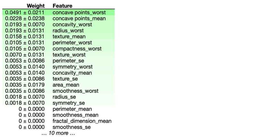
In our example, the most important feature is concave points_worst. The first number in each row shows how much model performance decreased with a random shuffling (in this case, using “accuracy” as the performance metric). We measure the randomness by repeating the process with multiple shuffles.
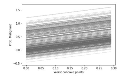
2. Individual Conditional Expectation (ICE)
How does the prediction change when 1 feature changes ? Individual Conditional Expectation, as its name suggests, is a plot that shows how a change in an individual feature changes the outcome of each individual prediction (one line per prediction). It can be used for regression tasks only. Since we face a classification task, we will re-use the linear regression model fitted above, and make our classification task look like a regression one.
To build ICE plots, simply use pycebox. Start off by installing the package :
pip install pycebox
from pycebox.ice import ice, ice_plot

ice_radius = ice(data=X_train, column='radius_mean', predict=model.predict)
ice_concave = ice(data=X_train, column='concave points_worst', predict=model.predict)
ice_smooth = ice(data=X_train, column='smoothness_se', predict=model.predict)
And build the plots :
ice_plot(ice_concave, c='dimgray', linewidth=0.3)
plt.ylabel('Prob. Malignant')
plt.xlabel('Worst concave points');
ice_plot(ice_radius, c='dimgray', linewidth=0.3)
plt.ylabel('Prob. Malignant')
plt.xlabel('Radius mean');
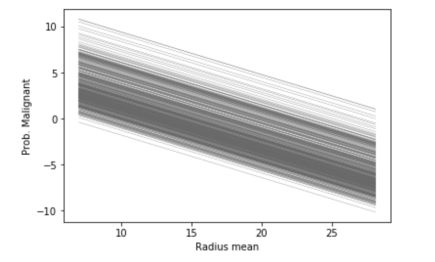
Logically, since our linear model involves a linear relation between the inputs and the output, the ICE plots are linear. However, if we use a Gradient Boosting Regressor to perform the same task, the linear relation does not hold anymore.
gb = GradientBoostingRegressor()
gb.fit(X_train, y_train)
ice_concave = ice(data=X_train, column='concave points_worst', predict=gb.predict)
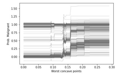
Thanks to ICEs, we understand the impact of a feature on the value of the outcome for each individual instance, and we easily understand trends. However, the ICE curves only display one feature at a time, and we cannot plot the joint importance of 2 features for example. Partial dependence plots overcome this issue.
3. Partial dependence plots
1D Partial Dependence Plot
Just like ICEs, Partial Dependence Plots (PDP) show how a feature affects predictions. They are however more powerful since they can plot joint effects of 2 features on the output.
Partial dependence plots are calculated after a model has been fitted. It tries to split the effect of every feature in the overall model’s predictions.
We start by selecting a single row. We will use the fitted model to predict the prediction of that row. But we repeatedly alter the value for one variable to make a series of predictions.
For example, in the breast cancer example used above, we could predict the outcome for different values of the radius : 10, 12, 14, 16…
We build the plot by:
- representing on the x-axis the value change in the radius
- and on the y-axis the change of the outcome
We don’t use only a single row, but many rows to do build this plot. The blue area corresponds to an empirical confidence interval. PDPs can be compared with ICEs for these kind of plots, but they show the average trend and confidence levels instead of individual lines. It makes trends easier to understand, although we loose the low-level vision for each prediction.
We can plot the Partial Dependence Plot using PDPbox. The goal of this library is to visualize the impact of certain features towards model prediction for any supervised learning algorithm using partial dependence plots.
To install PDPbox : pip install pdpbox
from pdpbox import pdp, get_dataset, info_plots
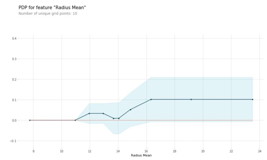
pdp_rad = pdp.pdp_isolate(model=rf, dataset=X_test, model_features=X_test.columns, feature='radius_mean')
pdp.pdp_plot(pdp_rad, 'Radius Mean')
plt.show()
2D Partial Dependence Plots
We can also plot interactions between features on a 2D graph.
features_to_plot = ['radius_mean', 'smoothness_se']

inter1  =  pdp.pdp_interact(model=gb, dataset=X_test, model_features=X.columns, features=features_to_plot)

pdp.pdp_interact_plot(pdp_interact_out=inter1, feature_names=features_to_plot, plot_type='contour', x_quantile=True, plot_pdp=True)
plt.show()
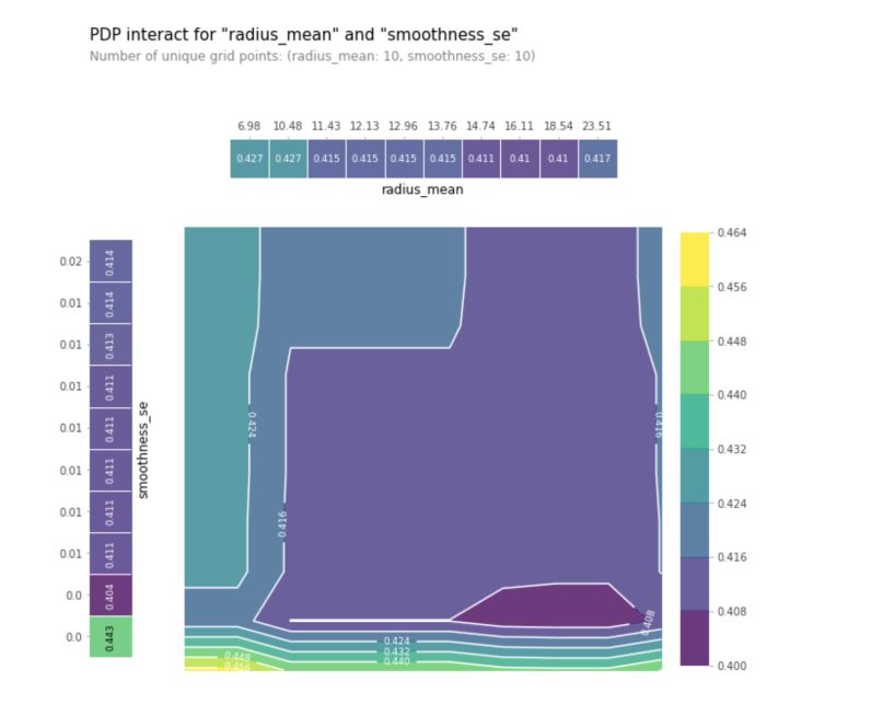
This plot helps to identify regions in which the tumor is more likely to be benign (darker regions) rather than malignant (lighter regions) based on the interaction between the mean of the radios and the standard error of the smoothness. We can then create similar plots for all pairs of variables.
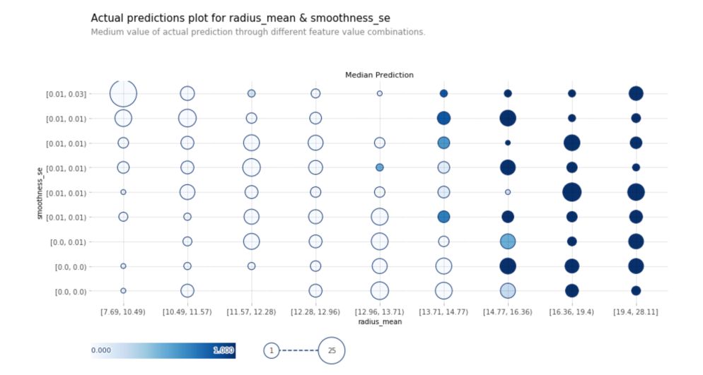
Actual Prediction Plot
Actual prediction plots show the medium value of actual predictions through different feature values for 2 predictions :
fig, axes, summary_df = info_plots.actual_plot_interact(
model=rf, X=X_train, features=features_to_plot, feature_names=features_to_plot
)
4. Shapley Values
Force plots
We have seen so far techniques to extract general insights from a machine learning model. Shapley values are used to break down a single prediction.
SHAP (SHapley Additive exPlanations) values show the impact of having a certain value for a given feature in comparison to the prediction we’d make if that feature took some baseline value.
In the breast cancer example, we could wonder how much was a prediction driven by the fact that the radius was 17.1mm, instead of some baseline number? That could help a doctor explain the predictions to a patient and understand how the internal mechanics of a model lead to the given outcome.
We can decompose a prediction with the following equation:
sum(SHAP values for all features) = pred_for_patient - pred_for_baseline_values
We will use the SHAP library. We will look at SHAP values for a single row of the dataset (we arbitrarily chose row 5). To install the shap package :
pip install shap
Then, compute the Shapley values for this row, using our random forest classifier fitted previously.
import shap

row = 5
data_for_prediction = X_test.iloc[row]  # use 1 arbitrary row of data
data_for_prediction_array = data_for_prediction.values.reshape(1, -1)

explainer = shap.TreeExplainer(rf)
shap_values = explainer.shap_values(data_for_prediction)
The shap_values is a list with two arrays. It’s cumbersome to review raw arrays, but the shap package has a nice way to visualize the results.
shap.initjs()
shap.force_plot(explainer.expected_value[1], shap_values[1], data_for_prediction)
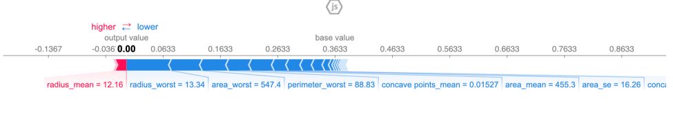
The output prediction is 0, which means the model classifies this observation as benign.
The base value is 0.3633. Feature values that push towards a malignant tumor causing are in pink, and the length of the region shows how much the feature contributes to this effect. Feature values decreasing the prediction and making our tumor benign are in blue. The biggest impact comes from radius_worst.
If you subtract the length of the blue bars from the length of the pink bars, it equals the distance from the base value to the output.
We explored so far Tree based models. shap.DeepExplainer works with Deep Learning models, and shap.KernelExplainer works with all models.
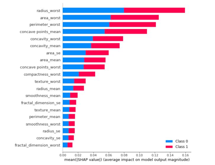
Summary plots
We can also just take the mean absolute value of the SHAP values for each feature to get a standard bar plot. It produces stacked bars for multi-class outputs:
shap.summary_plot(shap_values, X_train, plot_type="bar")
5. Approximation (Surrogate) models
Approximation models (or global surrogate) is a simple and quite efficient trick. The idea is really simple. We train an interpretable model to approach the predictions of a black-box algorithm.
We keep the original data, and use as targets the predictions made by the black-box algorithm. We can use any interpretable model, and benefit from all the advantages of the model chosen.
We must however pay attention to the performance of the interpretable model, since it might perform poorly in some regions.
6. Local Interpretable Model-agnostic Explanations (LIME)
Instead of training an interpretable model to approximate a black box model, LIME focuses on training local explainable models to explain individual predictions. We want the explanation to reflect the behavior of the model “around” the instance that we predict. This is called “local fidelity”.
LIME uses an exponential smoothing kernel to define the notion of neighborhood of an instance of interest.
We first select the instance we want to explain. By making small variations in the input data to the black-box model, we generate a new training set with these samples and their predicted labels. We then train an interpretable classifier on those new samples, and weight each sample according to how “close” it is to the instance we want to explain.
We benefit from the advantages of the interpretable model to explain each prediction.
We can implement LIME algorithm in Python with LIME package :
pip install lime
Then, lime takes only numpy arrays as inputs :
import lime
import lime.lime_tabular

explainer = lime.lime_tabular.LimeTabularExplainer(np.array(X_train), feature_names=np.array(X_train.columns), class_names=np.array([0, 1]), discretize_continuous=True)
We have defined the explainer. We can now explain an instance :
i = np.random.randint(0, np.array(X_test).shape[0])
exp = explainer.explain_instance(np.array(X_test)[i], rf.predict_proba, num_features=5, top_labels=1)
We make the choice to use 5 features here, but we could use more. To display the explanation :
exp.show_in_notebook(show_table = True, show_all= False)
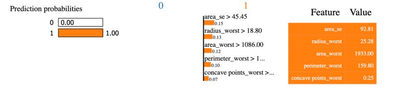
Since we had the show_all parameter set to false, only the features used in the explanation are displayed. The Feature - Value table is a summary of the instance we’d like to explain. The value column displays the original value for each feature.
The prediction probabilities of the black box model are displayed on the left.
The prediction of the local surrogate model stands under the 0 or the 1. Here, the local surrogate and the black box model both lead to the same output. It might happen, but it’s quite rare, that the local surrogate model and the black box one do not give the same output. In the middle graph, we observe the contribution of each feature in the local interpretable surrogate model, normalized to 1. This way, we know the extent to which a given variable contributed to the prediction of the black-box model.
Machine learning explainability techniques are an opportunity to use more complex and less transparent models, that usually perform well, and maintain trust in the output of the model.
If you’d like to read more on these topics, make sure to check these references :