
In the previous blog post “Complexity vs. explainability”, we highlighted the tradeoff between increasing the model’s complexity and loosing explainability. In this article, we will continue our discussion and cover the notions of interpretability and explainability in machine learning.
Machine Learning interpretability and explainability are becoming essential in solutions we build nowadays. In fields such as healthcare or banking, interpretability and explainability could for example help overcome some legal constraints. In solutions that support a human decision, it is essential to establish a trust relationship and explain the outcome and the internal mechanics of an algorithm. The whole idea behind interpretable and explainable ML is to avoid the black box effect.
Christoph Molnar has recently published an excellent book on this topic : Interpretable Machine Learning.
First of all, let’s define the difference between machine learning explainability and interpretability :
- Interpretability is linked to the model. A model is said to be interpretable if we can interpret directly the impact of its parameters on the outcome. Among interpretable models, one can for example mention : Linear and logistic regression, Lasso and Ridge regressions, Decision trees, etc.
- Explainability can be applied to any model, even models that are not interpretable. Explainability is the extent to which we can interpret the outcome and the internal mechanics of an algorithm.
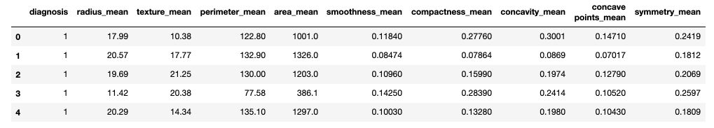
In this article, we will be using the UCI Machine learning repository Breast Cancer data set. It is also available on Kaggle. Features are computed from a digitized image of a fine needle aspirate (FNA) of a breast mass. They describe characteristics of the cell nuclei present in the image. There are 30 features, including the radius of the tumor, the texture, the perimeter… Our task will be to perform a binary classification of the tumor, that is either malignant (M) or benign (B).
Start off by importing the packages :
# Handle data and plot
import pandas as pd
import numpy as np
import matplotlib.pyplot as plt
import seaborn as sns

# Interpretable models
from sklearn.model_selection import train_test_split
from sklearn.metrics import r2_score
from sklearn.metrics import accuracy_score
import statsmodels.api as sm
from sklearn.linear_model import LogisticRegression
from sklearn.tree import DecisionTreeClassifier
from sklearn.tree import export_graphviz
import graphviz
Then, read the data and apply a simply numeric transformation of the label (“M” or “B”).
df = pd.read_csv('data.csv').drop(['id', 'Unnamed: 32'], axis=1)

def to_category(diag):
    if diag == "M" :
        return 1
    else :
        return 0

df['diagnosis'] = df['diagnosis'].apply(lambda x : to_category(x))
df.head()
X = df.drop(['diagnosis'], axis=1)
y = df['diagnosis']
X_train, X_test, y_train, y_test = train_test_split(X, y, test_size=0.2)
It is a great exercise to work on interpretability and explainability of models in the healthcare sector, since performing such work could typically be required by authorities.
In the next sections, we will cover the main interpretable models, their advantages, their limitations and examples. In the next article, we will explore explainability methods, as well as examples for each method.
Interpretable models
1. Linear Regression
Linear regression is probably the most basic regression model and takes the following form:
\(Y_i = {\beta}_0 + {\beta}_1{X}_{1i} + {\beta}_2{X}_{2i} + {\beta}_3{X}_{3i} + ... + {\epsilon}_i\).
This simple equation states the following :
- suppose we have \(n\) observations of a dataset and we pick the \(i^{th}\).
- \(Y_i\) is the target, e.g. the diagnosis of the breast tissue.
- \({X}_{1i}\) is the \(i^{th}\) observation of the first feature, e.g. the radius of the tumor.
- \({X}_{2i}\) is the \(i^{th}\) observation of the second feature, e.g. the texture of the tumor.
- …
- \({\beta}_0\) is called the intercept, it is a constant term.
- \({\beta}_1\) is the coefficient associated with \(X_{1i}\) . It describes the weight of \({X}_{1i}\) on the final output.
- …
- \({\epsilon}\) is the noise of the model. The data we observe rarrly stand on a straight line or on a hyperplane.
We can fit the linear regression using the statsmodel package :
model = sm.OLS(y_train, X_train).fit()
model.summary()
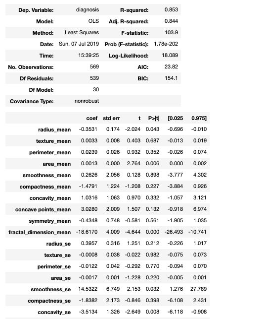
The statsmodel summary gives direct access to the coefficients, the standard errors, the t-statistics and the p-values for each feature.
Interpretability of Linear Regression
- The coefficients of a linear regression are directly interpretable. At stated above, each coefficient describes the effect on the output of a change of 1 unit of a given input.
- The importance of a feature can be seen as the absolute value of the t-statistic value. A feature is important if its coefficient is high and the variance around this estimate is low.
- In a binary classification task, each coefficient can be seen as a percentage of contribution to a class or another.
- The variance explained by the model can be explained by the \(R^2\) coefficient, displayed in the summary above.
- We can use confidence intervals and tests for coefficient values :
model.conf_int()
| 0 | 1 | |
| radius_mean | -0.854929 | -0.071102 |
| texture_mean | -0.007799 | 0.027502 |
| perimeter_mean | -0.028758 | 0.083970 |
| … | … | … |
- We are guaranteed to find the best coefficients by OLS properties
To illustrate the interpretability of the Linear Regression, we can plot the coefficient’s values and standard errors. This graph was inspired by the excellent work of Zhiya Zuo. Start by computing an error term equal to the difference between the parameter’s value and the lower confidence interval bound for this parameter, and build a single table with the coefficient, the error term and the name of the variable.
err = model.params - model.conf_int()[0]
coef_df = pd.DataFrame({'coef': model.params.values[1:], #drop the intercept
    'err': err.values[1:],
    'varname': err.index.values[1:]
})
Then, plot the graph :
coef_df.plot(y='coef', x='varname', kind='bar', color='none', yerr='err', legend=False, figsize=(12,8))
plt.scatter(x=np.arange(coef_df.shape[0]), s=100, y=coef_df['coef'], color='blue')
plt.axhline(y=0, linestyle='--', color='black', linewidth=1)
plt.title("Coefficient and Standard error")
plt.show()
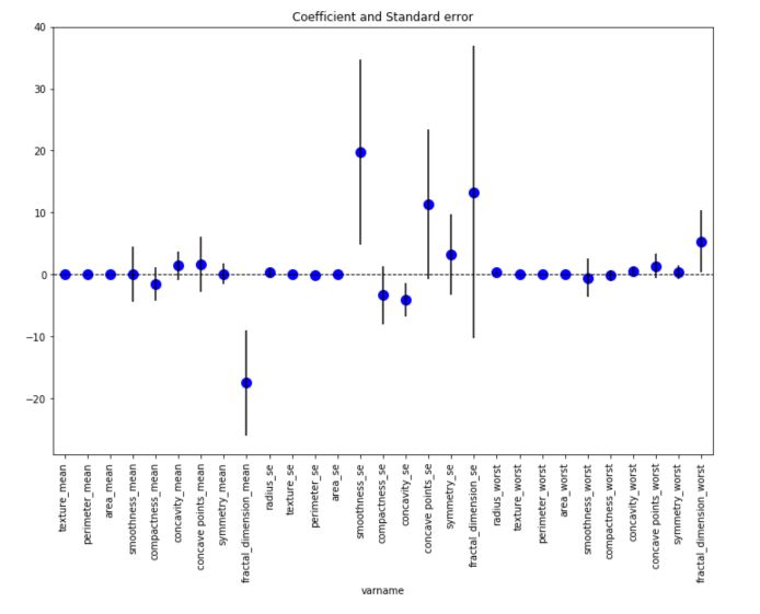
This graph displays for each feature, the coefficient value as well as the standard error around this coefficient. The smoothness_se seems to be one of the most important feature in this linear regression framework.
Limitations of Linear Regression
- Linear regression is a basic model. It is rare to observe linear relationships in the data, and the linear regression is rarely performing well.
- Moreover, when it comes to classification tasks, the linear regression is risky to apply, since a line or an hyperplane cannot constraint the output between 0 and 1. We prefer to apply the Logistic Regression in such case.
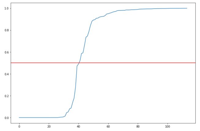
We can also illustrate the second limitation by plotting the predictions sorted by value :
plt.figure(figsize=(12,8))
plt.plot(np.sort(y_pred))
plt.axhline(0.5, c='r')
plt.title("Predictions")
plt.show()
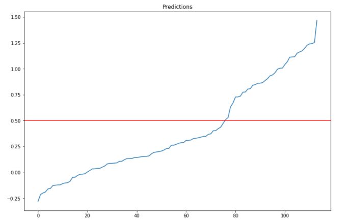
the output is not mapped between 0 and 1 systematically. Setting the threshold to 0.5 seems indeed to be an arbitrary choice.
We can show that modifying the threshold that we consider for classifying in one class or another has a large effect on the accuracy :
def classify(pred, thr = 0.5) :
    if pred < thr :
        return 0
    else :
        return 1

accuracy = []
for thr in np.linspace(0,1,100):
    y_pred_class = y_pred.apply(lambda x: classify(x, thr))
    accuracy.append(accuracy_score(y_pred_class, y_test))

plt.figure(figsize=(12,8))
plt.plot(accuracy)
plt.title("Acccuracy depending on threshold")
plt.show()
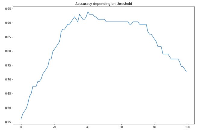
The maximum accuracy is reached for a threshold of 40.4% :
np.linspace(0,1,100)[np.argmax(accuracy)]
For this threshold, the accuracy achieved is 0.9385. Although the linear regression remains interesting for interpretability purposes, it is not optimal to tune the threshold on the predictions. We tend to use logistic regression instead.
2. Logistic Regression
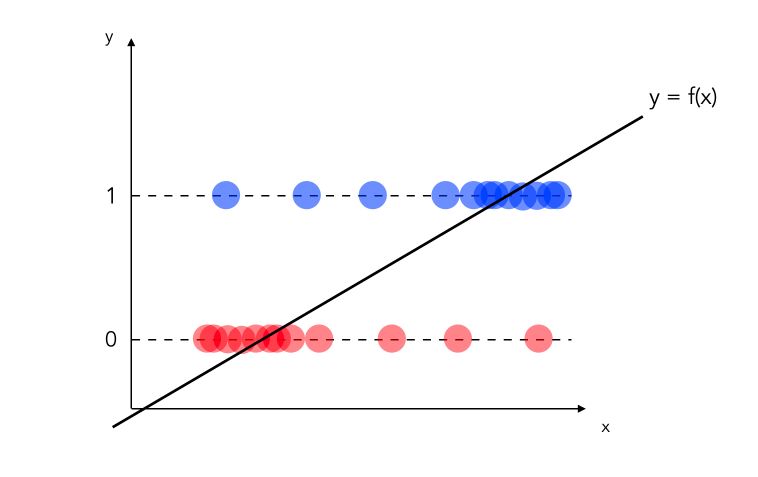
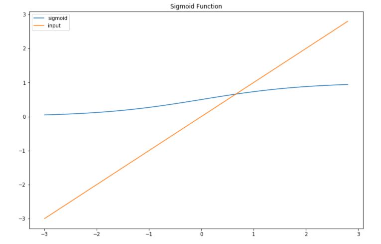
The logistic regression using the logistic function to map the output between 0 and 1 for binary classification purposes. The function is defined as :
\[Sig(z) = \frac {1} {1 + e^{-z}}\]In this plot, we represent both a sigmoid function and the inputs we feed it :
In the logistic regression model, instead of a linear relation between the input and the output, the relation is the following :
\[P(Y=1) = \frac {1} {1 + exp^{-(\beta_0 + \beta_1 X_1 + ... + \beta_p X_p)}}\]How can we interpret the partial effect of \(X_1\) on \(Y\) for example ? Well, the weights in the logistic regression cannot be interpreted as for linear regression. We need to use the logit transform :
\[\log( \frac {P(y=1)} {1-P(y=1)} ) = \log ( \frac {P(y=1)} {P(y=0)} )\] \[= odds = \beta_0 + \beta_1 X_1 + ... + \beta_k X_k\]We define the this ratio as the “odds”. Therefore, to estimate the impact of \(X_j\) increasing by 1 unit, we can compute it this way :
\[\frac {odds_{X_{j+1}}} {odds} = \frac {exp^{\beta_0 + \beta_1 X_1 + ... + \beta_j (X_j + 1) + ... + \beta_k X_k}} {exp^{\beta_0 + \beta_1 X_1 + ... + \beta_j X_j + ... + \beta_k X_k}}\] \[= exp^{\beta_j (X_j + 1) - \beta_j X_j} = exp^{\beta_j}\]A change in \(X_j\) by one unit increases the log odds ratio by \(exp^{\beta_j}\). In other words, an increase in the log-odds ratio is proportional to classifying a bit more in class 1 rather than to class 0, according to an exponential factor in \(\beta_j\).
The implementation is straight forward in Python using scikit-learn.
lr = LogisticRegression()
lr.fit(X_train, y_train)
y_pred = lr.predict(X_test)
y_proba = lr.predict_proba(X_test)
print(accuracy_score(y_pred, y_test))
0.9473684210526315
Interpretability of Logistic Regression
With the logistic regression, we keep most of the advantages of the linear regression. For example, we can plot the value of the coefficients :
plt.figure(figsize=(12,8))
plt.barh(X.columns,lr.coef_[0])
plt.title("Coefficient values")
plt.show()
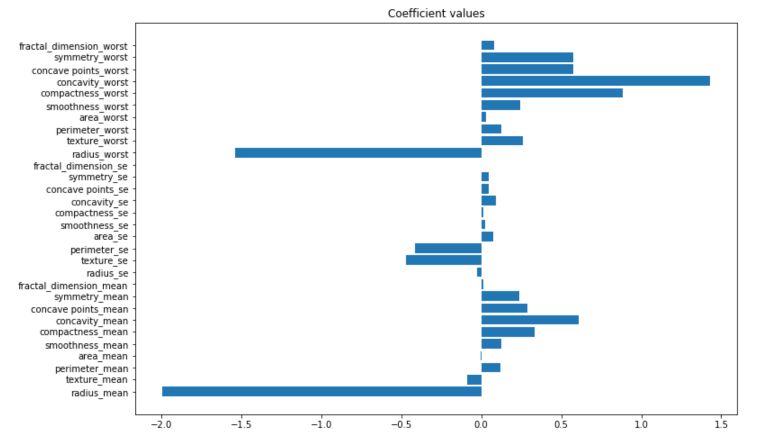
An increase in the concavity_worst is more likely to lead to a malignant tumor, whereas an increase in te radius_mean is more likely to lead to a benign tumor. It is a model meant for binary classification, so the prediction probabilities are sent between 0 and 1.
plt.figure(figsize=(12,8))
plt.plot(np.sort(y_proba[:,0]))
plt.axhline(0.5, c='r')
plt.show()
Limitations of Logistic Regression
Just like linear regression, the model remains quite limited in terms of performance, although a good regularization can offer decent performance. The coefficients are not as easily interpretable as for the linear regression. There is a tradeoff to make when choosing these kind of models, and they are often used in customer classification for car rental companies or in banking industry for example.
3. Decision Trees
Linear regression and logistic regression cannot model interactions between features. The Classification And Regression Trees (CART) algorithm is the most simple and popular tree algorithm, and models a simple interaction between features.
To build the tree, we choose each time the feature that splits our data the best way possible. How do we measure the qualitiy of a split ? We apply criteria such as the cross-entropy or Gini impurity. We stop the development of the tree when splitting a node does not lower the impurity.
To implement decision trees in Python, we can use scikit-learn :
clf = DecisionTreeClassifier(max_depth=3)
clf.fit(X_train, y_train)
y_pred = clf.predict(X_test)
accuracy_score(y_pred, y_test)
0.9210526315789473
Interpretability of CART algorithm
By growing the depth of the tree, we add “AND” conditions. For a new instance, the feature 1 is larger than a and the feature 3 is smaller than b and the feature 2 equals c.
CART algorithm offers a nice way to compute the importance of each feature in the model. We measure the importance of a Gini index by the extent to which the chosen citeria has been decreased when creating a new node on the given feature.
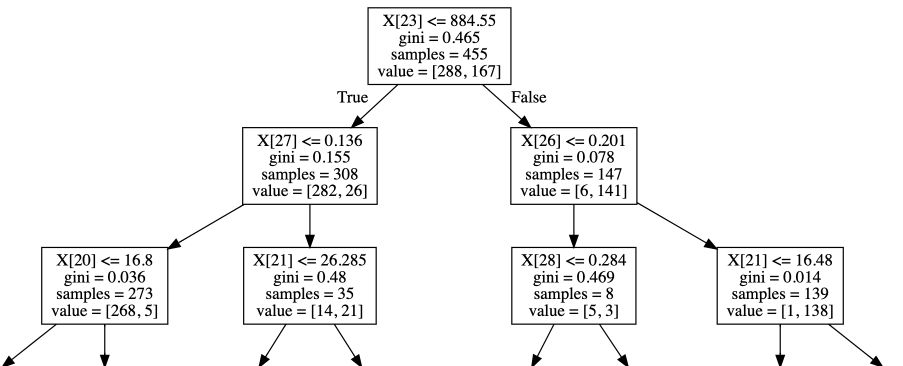
The tree offers a natural interpretability, and can be represented visually :
export_graphviz(clf, out_file="tree.dot")
with open("tree.dot") as f:
dot_graph = f.read()

graphviz.Source(dot_graph)
Limitations of CART algorithm
CART algorithms fails to represent linear relationships between the input and the output. It easily overfits and gets quite deep if we don’t crontrol the model. For this reason, tree based ensemble models such as Random Forest have been developped.
4. Other models
There are other models that are by construction interpretable :
- K-Nearest Neighbors (KNN)
- Generalized Linear Models (GLMs)
- Lasso and Ridge Regressions
- Stochastic processses such as Poisson processes if you want to model arrival rates or goals in a football match
- …
We have covered in this article the motivation for interpretable and explainable machine learning, as well as the main interpretable models. In the next article, we will see how to explain the outcomes of black-box models through model explainability.
If you’d like to read more on this topic, make sure to check these references :