
In this series, I will summarize the course “Machine Learning Explaibnability” from Kaggle Learn. The full course is available here.
First of all, it is important to define the difference between machine learning explainability and interpretability. According to KDnuggets :
- Interpretability is about the extent to which a cause and effect can be observed within a system. Or, to put it another way, it is the extent to which you can predict what is going to happen, given a change in input or algorithmic parameters.
- Explainability, meanwhile, is the extent to which the internal mechanics of a machine or deep learning system can be explained in human terms.
Explainability and interpretability are key elements today if we want to deploy ML algorithms in healthcare, banking, and other domains.
I. Use cases for model insights
In this course, we will answer the following questions on model insights extraction :
- What features in the data did the model think are most important?
- For any single prediction from a model, how did each feature in the data affect that particular prediction?
- How does each feature affect the model’s predictions in a big-picture sense (what is its typical effect when considered over a large number of possible predictions)?
These insights are valuable since they have many use cases.
Debugging
Understanding the patterns a model is finding helps us identify when these patterns are odds. This is the first step to track bugs, unreliable and dirty data.
Informing feature engineering
Feature engineering is a great way to improve model accuracy. It implies a transformation of the existing features. But what happens when we have up to 100 features, when we don’t have the right background to create smart features or when for privacy reasons the column names are not available?
By identifying the most important features, it is then much easier to simply create an addition, a subtraction or a multiplication between 2 features for example.
Directing future data collection
Many businesses can expand the types of data they collect. Model-based insights show you what are the most important features to collect, and helps you reason about what new values may be most useful.
Informing human decision-making
For many human decisions that cannot (yet?) be made automatically by an algorithm, insights on the model prediction can bring explainability to support a decision.
Building trust
Many people won’t assume they can trust your model for important decisions without verifying some basic facts. Showing the right insights, even to people with few data science knowledge, is important.
II. Permutation importance
What features have the biggest impact on predictions? There are many ways to compute feature importance. We will focus on permutation importance, which is :
- fast to compute
- widely used
- consistent with the properties needed
How does it work?
Permutation importance is computed after a model has been fitted. It answers the following question : If with randomly shuffle a single column of the validation data, leaving the target and all other columns in place, how would that affect the accuracy?
For example, say we want to predict the height of a person at age 20 based on a set of features, including some less relevant ones (the number of socks owned at age 10):
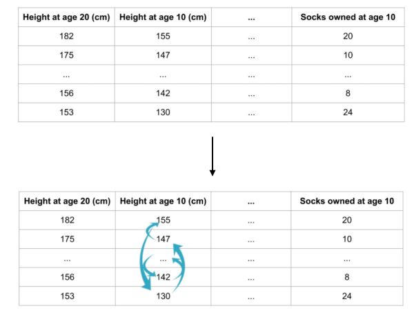
Randomly re-ordering a single column should decrease the accuracy. Depending on how relevant the feature is, it will more or less impact the accuracy. From the impact on accuracy, we can determine the importance of a feature.
Example
In this example, we will try to predict the “Man of the Game” of a football match based on a set of features of a player in a match.
import numpy as np
import pandas as pd
from sklearn.model_selection import train_test_split
from sklearn.ensemble import RandomForestClassifier

data = pd.read_csv('../input/fifa-2018-match-statistics/FIFA 2018 Statistics.csv')

y = (data['Man of the Match'] == "Yes")  # Convert from string "Yes"/"No" to binary
feature_names = [i for i in data.columns if data[i].dtype in [np.int64]]
X = data[feature_names]

X_train, X_test, y_train, y_test = train_test_split(X, y, random_state=1)
my_model = RandomForestClassifier(random_state=0).fit(X_train, y_train)
We can then compute the Permutation Importance with Eli5 library. Eli5 is a Python library which allows to visualize and debug various Machine Learning models using unified API. It has built-in support for several ML frameworks and provides a way to explain black-box models.
import eli5
from eli5.sklearn import PermutationImportance

perm = PermutationImportance(my_model, random_state=1).fit(X_test, y_test)
eli5.show_weights(perm, feature_names = val_X.columns.tolist())
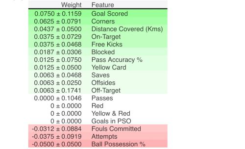
In our example, the most important feature was Goals scored. The first number in each row shows how much model performance decreased with a random shuffling (in this case, using “accuracy” as the performance metric). We measure the randomness by repeating the process with multiple shuffles.
A negative value for importance occurs when the feature is not important at all.
III. Partial dependence plots
While feature importance shows what variables most affect predictions, partial dependence plots show how a feature affects predictions.
Partial dependence plots can be interpreted similarly to coefficients in linear or logistic regression models but can capture more complex patterns than simple coefficients.
We can use partial dependence plots to answer questions like :
- Controlling for all other house features, what impact do longitude and latitude have on home prices? To restate this, how would similarly sized houses be priced in different areas?
- Are predicted health differences between the two groups due to differences in their diets, or due to some other factor?
How does it work?
Partial dependence plots are calculated after a model has been fit. How do we then disentangle the effects of several features?
We start by selecting a single row. We will use the fitted model to predict our outcome of that row. But we repeatedly alter the value for one variable to make a series of predictions.
For example, in the football example used above, we could predict the outcome if the team had the ball 40% of the time, but also 45, 50, 55, 60, …
We build the plot by:
- representing on the horizontal axis the value change in the ball possession for example
- and on the horizontal axis the change of the outcome
We don’t use only a single row, but many rows to do that. Therefore, we can represent a confidence interval and an average value, just like on this graph:
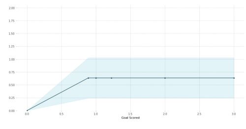
The blue shaded area indicates the level of confidence.
Example
Back to our FIFA Man of the Game example :
import numpy as np
import pandas as pd
from sklearn.model_selection import train_test_split
from sklearn.ensemble import RandomForestClassifier
from sklearn.tree import DecisionTreeClassifier

data = pd.read_csv('../input/fifa-2018-match-statistics/FIFA 2018 Statistics.csv')

y = (data['Man of the Match'] == "Yes")  # Convert from string "Yes"/"No" to binary
feature_names = [i for i in data.columns if data[i].dtype in [np.int64]]
X = data[feature_names]

X_train, X_test, y_train, y_test = train_test_split(X, y, random_state=1)
tree_model = DecisionTreeClassifier(random_state=0, max_depth=5, min_samples_split=5).fit(X_train, y_train)
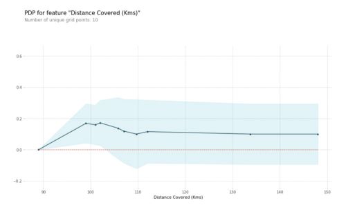
Then, we can plot the Partial Dependence Plot using PDPbox. The goal of this library is to visualize the impact of certain features towards model prediction for any supervised learning algorithm using partial dependence plots. The PDP for the number of goals scored is the following :
from matplotlib import pyplot as plt
from pdpbox import pdp, get_dataset, info_plots

# Create the data that we will plot
pdp_goals = pdp.pdp_isolate(model=tree_model, dataset=X_test, model_features=feature_names, feature='Goal Scored')

# plot it
pdp.pdp_plot(pdp_goals, 'Goal Scored')
plt.show()
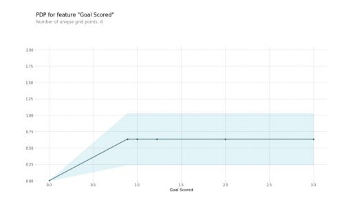
From this particular graph, we see that scoring a goal substantially increases your chances of winning “Man of The Match.” But extra goals beyond that appear to have little impact on predictions.
We can pick a more complex model and another feature to illustrate the changes :
# Build Random Forest model
rf_model = RandomForestClassifier(random_state=0).fit(X_train, y_train)

pdp_dist = pdp.pdp_isolate(model=rf_model, dataset=X_test, model_features=feature_names, feature=feature_to_plot)

pdp.pdp_plot(pdp_dist, feature_to_plot)
plt.show()
2D Partial Dependence Plots
We can also plot interactions between features on a 2D graph.
# Similar to previous PDP plot except we use pdp_interact instead of pdp_isolate and pdp_interact_plot instead of pdp_isolate_plot

features_to_plot = ['Goal Scored', 'Distance Covered (Kms)']

inter1  =  pdp.pdp_interact(model=tree_model, dataset=X_test, model_features=feature_names, features=features_to_plot)

pdp.pdp_interact_plot(pdp_interact_out=inter1, feature_names=features_to_plot, plot_type='contour')
plt.show()
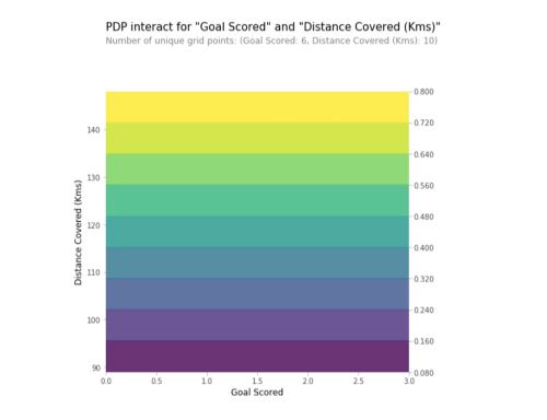
In this example, each feature can only take a limited number of values. What happens if we have continuous variables? The level frontiers bring value on the interaction between the 2 variables.
IV. SHAP Values
We have seen so far techniques to extract general insights from a machine learning model. What if you want to break down how the model works for an individual prediction?
SHAP Values (an acronym from SHapley Additive exPlanations) break down a prediction to show the impact of each feature.
This could be used for :
- banking automatic decision making
- healthcare risk factor assessment for a single person
In summary, we use SHAP values to explain individual predictions.
How does it work?
SHAP values interpret the impact of having a certain value for a given feature in comparison to the prediction we’d make if that feature took some baseline value.
In our football example, we could wonder how much was a prediction driven by the fact that the team scored 3 goals, instead of some baseline number of goals?
We can decompose a prediction with the following equation:
sum(SHAP values for all features) = pred_for_team - pred_for_baseline_values
The SHAP Value can be represented visually as follows :

The output value is 0.70. This is the prediction for the selected team. The base value is 0.4979. Feature values causing increased predictions are in pink, and their visual size shows the magnitude of the feature’s effect. Feature values decreasing the prediction are in blue. The biggest impact comes from Goal Scored being 2. Though the ball possession value has a meaningful effect decreasing the prediction.
If you subtract the length of the blue bars from the length of the pink bars, it equals the distance from the base value to the output.
Example
We will use the SHAP library. As previously, we import the Football game example. We will look at SHAP values for a single row of the dataset (we arbitrarily chose row 5).
import shap  # package used to calculate Shap values

row_to_show = 5
data_for_prediction = X_test.iloc[row_to_show]  # use 1 row of data here. Could use multiple rows if desired
data_for_prediction_array = data_for_prediction.values.reshape(1, -1)

# Create object that can calculate shap values
explainer = shap.TreeExplainer(my_model)

# Calculate Shap values
shap_values = explainer.shap_values(data_for_prediction)
The shap_values is a list with two arrays. It’s cumbersome to review raw arrays, but the shap package has a nice way to visualize the results.
shap.initjs()
shap.force_plot(explainer.expected_value[1], shap_values[1], data_for_prediction)

The output prediction is 0.7, which means that the team is 70% likely to have a player win the award.
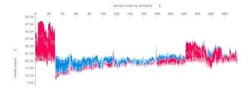
If we take many explanations such as the one shown above, rotate them 90 degrees, and then stack them horizontally, we can see explanations for an entire dataset:
# visualize the training set predictions
shap.force_plot(explainer.expected_value, shap_values, X)
So far, we have used shap.TreeExplainer(my_model). The package has other explainers for every type of model :
shap.DeepExplainerworks with Deep Learning models.shap.KernelExplainerworks with all models, though it is slower than other Explainers and it offers an approximation rather than exact Shap values.
Advanced uses of SHAP Values
Summary plots
Permutation importance creates simple numeric measures to see which features mattered to a model. But it doesn’t tell you how each features matter. If a feature has medium permutation importance, that could mean it has :
- a large effect for a few predictions, but no effect in general, or
- a medium effect for all predictions.
SHAP summary plots give us a birds-eye view of feature importance and what is driving it.
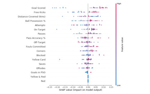
Each dot has 3 characteristics :
- Vertical location shows what feature it is depicting
- The color shows whether the feature was high or low for that row of the dataset
- Horizontal location shows whether the effect of that value caused a higher or lower prediction
In this specific example, the model ignored Red and Yellow & Red features. High values of goal scored caused higher predictions, and low values caused low predictions.
Summary plots can be built the following way :
# Create an object that can calculate shap values
explainer = shap.TreeExplainer(my_model)

# Calculate shap_values for all of X_test rather than a single row, to have more data for plot.
shap_values = explainer.shap_values(X_test)

# Make plot. Index of [1] is explained in text below.
shap.summary_plot(shap_values[1], X_test)
Computing SHAP values can be slow on large datasets.
SHAP Dependence Contribution plots
Partial Dependence Plots to show how a single feature impacts predictions. But they don’t show the distribution of the effects for example.
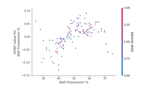
Each dot represents a row of data. The horizontal location is the actual value from the dataset, and the vertical location shows what having that value did to the prediction. The fact this slopes upward says that the more you possess the ball, the higher the model’s prediction is for winning the Man of the Match award.
The spread suggests that other features must interact with Ball Possession %. For the same ball possession, we encounter SHAP values that range from -0.05 to 0.07.
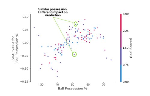
We can also notice outliers that stand out spatially as being far away from the upward trend.
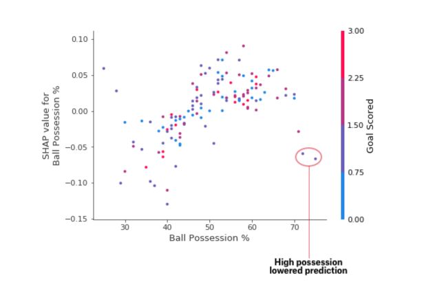
We can find an interpretation for this: In general, having the ball increases a team’s chance of having their player win the award. But if they only score one goal, that trend reverses and the award judges may penalize them for having the ball so much if they score that little.
To implement Dependence Contribution plots, we can use the following code :
# Create an object that can calculate shap values
explainer = shap.TreeExplainer(my_model)

# calculate shap values. This is what we will plot.
shap_values = explainer.shap_values(X)

# make plot.
shap.dependence_plot('Ball Possession %', shap_values[1], X, interaction_index="Goal Scored")
Summary plots
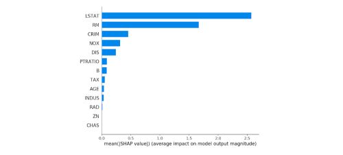
We can also just take the mean absolute value of the SHAP values for each feature to get a standard bar plot (produces stacked bars for multi-class outputs):
shap.summary_plot(shap_values, X, plot_type="bar")
Interaction plots
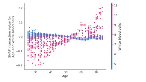
We can represent the interaction effect for two features and the effect on the SHAP Value they have. This can be done by plotting a dependence plot between the interaction values. Let’s take another random example in which we consider the interaction between the age and the white blood cells, and the effect this has on the SHAP interaction values :
shap.dependence_plot(
("Age", "White blood cells"),
shap_interaction_values, X.iloc[:2000,:],
display_features=X_display.iloc[:2000,:]
)
**Conclusion **: That’s it for this introduction to Machine Learning Explainability! Don’t hesitate to drop a comment if you have any question.