
In this article, we’ll introduce the field of Data Visualization. I’m trying to bring a clear summary of the different courses I have had and the resources I have read. I am listing the resources I am referring to at the end of this article.
There are many things you should already be familiar with, but I think it’s a great exercise to formalize it. Hopefully, you’ll also learn some new stuff!
What is Data Viz?
Let’s kick this with a definition of Data Visualization :
Visualization is a cognitive process that allows to form a mental image to gain insights, discover, make decisions and explain. Data Visualization is the use of computer-supported, interactive visual representations of data to amplify cognition.
Basis of Data Viz
There are 3 main subfields of Data Viz :
- Scientific visualization, whose role is to model real-world phenomena
- Information visualization, whose role is to map a more abstract concept into 2D or 3D for decision making and analysis purposes
- Visual analytics, which is the frontier of Data mining and Machine Learning
There are 3 main types of variables :
- Qualitative (Nominal or ordinal)
- Quantitative
- Metadata which is descriptive information about the data
There are cognitive benefits of information visualization since it can amplify cognition in several ways :
- Increasing memory and processing resources available
- Reducing search for information
- Enhancing the recognition of patterns
- Enabling perceptual inference operations
- Using perceptual attention mechanisms for monitoring
- Encoding information in a manipulable medium
The value of information visualization can be computed using the information of the number of users visualizing the data, the frequency and the time spared at each time.
The key attributes to implement or not when developing a visualization tool are :
- the scalability to a large number of data
- the interactivity to offer multiple views to a user
Why use Data Viz?
The volume of data produced yearly is growing exponentially. From 800 Exabytes in 2008 to 900 Zettabytes in 2017 (so large it’s even hard to count the number of 0s: 900000000000000000000000 bytes). How do we make sense of such a large amount of data? How can we make this data understandable and exploitable?
We use Data Viz to help people rapidly narrow in from a large space and find parts of the data to study more carefully. Visualization and visual contents have been chosen since among the human senses, the vision has the highest band with, with over 100Mb/s theoretically. Ears only allow the processing of 100 bytes/second on the other hand.
Why is vision so effective?
- *Preattentive processing *: some visual features can be perceived very rapidly and accurately by our low-level visual system (e.g identifying a red dot in the middle or grey dots)
- *Gestalt theory *: the visual systems understand an image using proximity, similarity, continuity, symmetry, close and relative size features.
We use the viz for better decision making, better anomaly detection… Overall, we want the end-user to be better and more effective at his task. Computers allow simply to map a large volume of data and to update the visualization as often as needed.
When to use Data Viz?
There are several conditions for information browsing to be useful :
- When there is a good underlying structure so that items close to one another can be inferred to be similar
- When users are unfamiliar with a collection’s contents
- When users have a limited understanding of how a system is organized and prefer a less cognitively loaded method of exploration
- When users have difficulty verbalizing the underlying information need
- When information is easier to recognize than describe
Data mapping
How do we map data to a *representation *?
- We first define a space, usually using axis
- Then we define the marks we’ll be using, which are the things that occur in the space (points, stars, dots…)
- Then the graphical properties of marks (size, position, orientation, color, texture…)
Our aim should be to increase the use of space, encode data, and make the graph efficient. There are overall only 5 main categories of graphs :
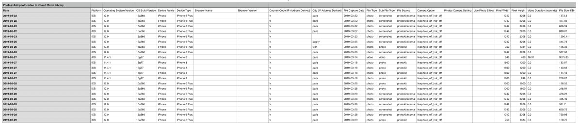
- Data tables, like Excel Sheets for example
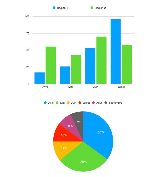
- Graphs on rails or planes (visually, we can see a 1D plot as a single rail, a 2D plot as a combination of rails, a Pie chart as a single rail folded…)
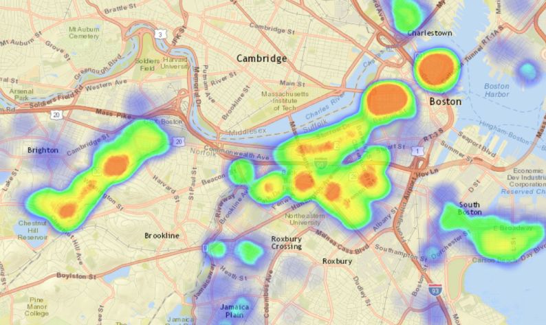
- Geospatial maps, which is the mapping of the latitude and longitude on a 2D plane, in which we can add some information (features on a map, size of components…)
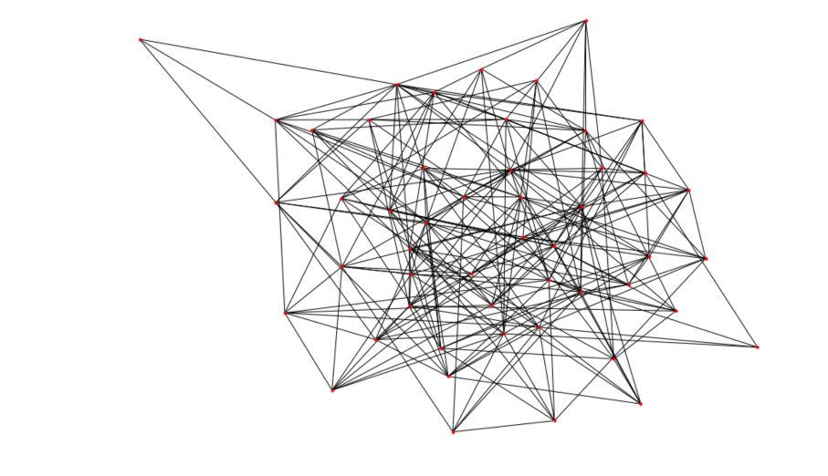
- Network diagrams, whose role is to display the relation between items. In such diagrams
- Symbols and conceptual images, which can be any logo whose aim is to present an information (e.g the PEGI 12 logo on a video game)
One of the issues that arise is when we need to represent hyper-variate data. How to do this?
- Represent the data on a data table. This is a high dimensional mapping on a 2D plane. This is however not very efficient.
- Reduce the dimension using PCA or t-SNE for example, but this implies losing the meaning behind the clusters for example
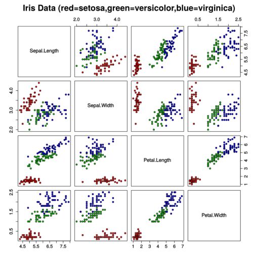
- Plot a scatterplot matrix to identify the correlation between individual dimensions, but this does not combine the different dimensions, and we can easily get too many graphs to look at.
- Encode dimensions in features of the markers: e.g the size of the marker, the shape, the color… This can be efficient, but there is a limit to the number of dimensions we can map, and it quickly gets impossible to read. (Check Chernoff Faces for a fun example of how to map many dimensions on human-looking faces.)
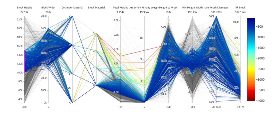
- Use parallel coordinates: we encode variable along a horizontal row. Parallel coordinates are the best way to represent high dimensional data. Vertical lines specify different values that a variable can take. Data points are represented as a polyline. Different variable can have values taking quite different ranges. We might need to scale it. We also need to reorder the dimensions to have the most similar next to one another.
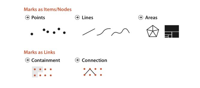
Marks and channels
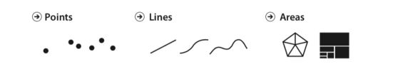
These are the building blocks of a design space of visual encodings. The pictures are taken from Tamara Munzner, Visualization Analysis and Design (2014), fig 5.3:
- Marks are basic geometric elements that depict items or links (point, line, area)
- and channels control their appearance, independently of the dimensionality go the geometric primitive. (position, color, shape, tilt (angle), size)
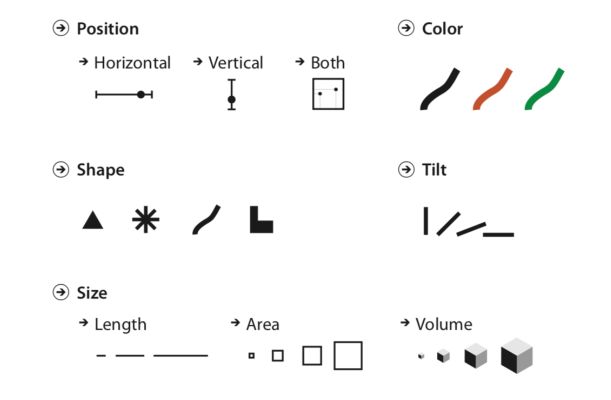
An area mark has both dimensions of its size constrained intrinsically as part of its shape, so area marks typically are not size coded or shape coded. (e.g the shape of a country). Bar plots can be made wider to encode an additional dimension. Point marks can be size coded and shape coded.
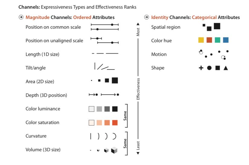
Which channel to choose?
- The channels that show magnitude information are good for ordered data. (how much is it? How much longer? How much wider ?…)
- The channels that show identity information are good with categorical data. (What is it? Where is it? Is it a line ?…)
Usually, a mark represents an item. (In a table dataset for example). In a network dataset, a mark can represent an item (node), or a link between items. There are 2 types of link marks :
- Connection mark shows a pairwise relationship between 2 items using a line
- Containment marks show hierarchical relationships using areas, nested in each other at multiple levels
The human visual system does not process 2 different channels in the same way. We decide which channel to use according to 2 principles :
- **Expressiveness **: visual encoding should express only the information in the dataset attributes. Ordered data should be shown as ordered, and vice versa
- **Effectiveness **: the most important attributes should be encoded with the most effective channels to be most noticeable
What channel is effective when it comes to visual encoding?
How has this ranking been established? Why are some channels better than others? There are some ways to measure effectiveness :
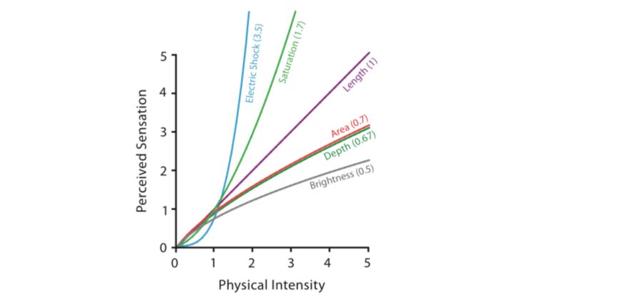
- Accuracy: how close is human perceptual judgment to some objective measurement of the stimulus? Psychophysics study the measurement of general human perception. Our responses to the sensory experience of magnitude are characterizable by power laws, where the exponent depends on the exact sensory modality. The psychophysical power law of Stevens states that \(S = I^n\) where \(S\) in the received sensation, \(I\) the physical intensity and \(n\) the power-law exponent.
- **Discriminability **: if you encode data using a particular visual channel, are the differences between items perceptible to the human as intended?
- **Separability **: You cannot treat all visual channels as completely independent from each other, because some have dependencies and interactions with others. You must consider a continuum of potential interactions between channels for each pair, ranging from the orthogonal and independent separable channels to the inextricably combined integral channels.
- **Popout **: How well a distinct item stands out from many others immediately. Our low-level visual system does massively parallel processing on these visual channels, without the need for the viewer to consciously directly attention to items one by one. However, when the popout does not occur, it requires a serial search, whose time depends on the number of marks in the graph.

- **Grouping **: Arises from the use of link marks or identity channels to encode categorical attributes. Containment is the strongest cue for grouping, with connection coming in second, and proximity the third.
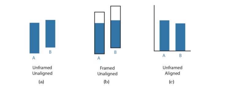
The human perceptual system is fundamentally based on relative judgments, not absolute ones; this principle is known as Weber’s Law. For instance, the amount of length difference we can detect is a percentage of the object’s length. When considering questions such as the accuracy and discriminability of our perceptions, we must distinguish between relative and absolute judgments. For example, when two objects are directly next to each other and aligned, we can make much more precise judgments than when they are not aligned and when they are separated with many other objects between them.
Tasks and interactions
InfoVis is developed to answer the user’s tasks.
InfoVis is used at ** high-level** to either :
- Produce Information :
- Annotate: Manual task to bring new attributes to the data (e.g cluster label)
- Record: Save or capture visualization elements as persistent artifacts (screenshots, book-marked elements, locations, parameter settings… to assemble a graphical history).
- Derive: produce new data elements based on existing data elements. Extend the dataset beyond attributes. For example, go beyond City name and add Coordinates using an external table. Or compute trade balance using import and exports. A new derived attribute may be created using arithmetic, logical or statistical operations ranging from simple to complex.
- Consume information that has already been generated as data stored
- Present information: To tell a story with data, guide the audience through a series of cognitive operations, Communicate… Whether it is dynamic or static.
- Discover: Use Vis to find new knowledge that was not previously known :
- Generate a new hypothesis
- Verify or disconfirm the existing hypothesis
- Enjoy: Curiosity (Infographic on a blog post for example)
At ** middle-level**, Search is used to localize known or unknown data.
- Lookup: The user knows what he’s looking for and where it is
- Locate: Find a known target at an unknown location.
- Browse: Exact identify of a search target might not be known in advance but specified based on characteristics
- Explore: Users are not sure of the location.
At ** low-level**, the tasks take the following form :
- **Retrieve value **: Maybe the simplest task, in which we aim to display a value
- **Filter **: Filters should only show the data matching a set of conditions
- **Compute derived value **: Compute an aggregate value for a set of data cases
- **Find extremum **: Find cases at either extreme of the data set for a given attribute
- **Sort **: Rank data cases according to some ordinal metric
- **Determine range **: Identify the span of values for a given set of data cases and attributes
- **Characterize distribution **: For a given set of cases and attributes, characterize the distribution of the value over the set
- **Find anomalies **: Identify anomalies in a set of data cases concerning a given relationship/expectation
- **Cluster **: Within a set of cases, identify any clusters of similar attribute values
- **Correlate **: For a given set of cases and 2 attributes, determine useful attributes correlations
- …
Once a target or set of targets for a search has been found, a low-level user goal is to query these targets to :
- Identify: Single target.
- Compare: Multiple targets.
- Summarize: All possible targets.
In InfoVis, the user first understands the information displayed on a graph and then starts to work around and manipulate the data. This part is called the interaction. There are several kinds of interactions :
- **Select **: Mark something as interesting
- **Explore **: Show something else
- Reconfigure : Show a different arrangement
- Encode : Show a different representation
- Abstract/Elaborate : Show less or more details
- **Filter **: Show something conditionally
- Connect : Show related items
To aim for visual continuity and avoid a conversation break, the ideal response time is somewhere around 0.1 second.
Visual Perception
Semiotics is the study of symbols and how they convey meaning. Perceptual processing is the process to seek to better understand visual perception and visual information. The visual perception, with some underlying hypothesis, is made of 2 major steps :
- a parallel extraction of low-level properties of the scene, called preattentive process
- a sequential goal-directed process
Preattentive process
The preattentive process is the early, parallel detection of color, texture, shape, spatial attributes. The main features of the preattentive process are the following :
- It is achieved without any kind of focus or attention
- It usually lasts less than 200-250ms (The length of eye movements is 200ms)
- It is parallelized by the low-vision system
The preattentive process follows some basic rules :
- A larger set size means a longer processing time
- A larger set difference (i.e labels difference) implies a smaller processing time
- Categorical processing is easy to find when unique
- We, as humans, cannot process both color and shape pre-attentively
Certain elements lend themselves to preattentive processing :
- Width
- Size
- Curvature
- Number
- Intensity
- Hue
- Closure
- …
Sequential goal-directed processing
Sequential goal-directed processing is a serial processing of an object using memory and spatial layout. We usually split an object into subsystems for recognition tasks. This is a slow serial process, implying work and long-term memory.
Famous Tools
Along with matplotlib, pandas, seaborn…, there are some really good tools that are used for Data Visualization :
- Tableau, for drag&drop UX, and great dashboards
- Altair, for a programmatic tool similar to Tableau, in Python
- D3.js for interactive JS graphs
- …
Recommended resources
The key resources I have been working in this field are the following :
- Visualization Analysis and Design by Tamara Munzner
- The Value of Information Visualization
You can download the dataset right here.
Conclusion : That’s it ! I hope this introduction to Altair was interesting. I love to use this on my Data Viz projects. Feel free to leave a comment if you have one.