
If you ever used Tableau, you know how easy and user-friendly it is for the end-user. Altair is a great Python library that allows you to program dashboard and other great stuff done in Tableau. Altair uses a so-called declarative approach in which we state what we want instead of stating how to get it.
Before we start
We’ll be using Jupyter Lab on this one. First of all, install Jupyter Lab, Altaire and Vega :
pip install jupyterlab altair vega vega_datasets
Then, launch Jupyter Lab :
jupyter lab
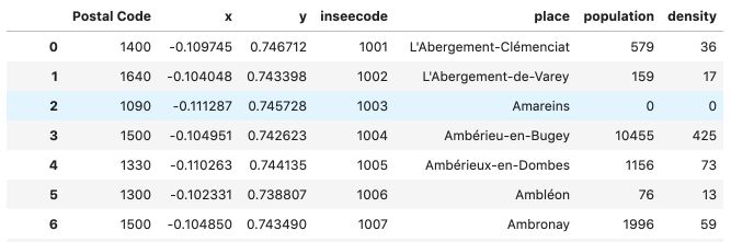
We will use data from the French population that contains for each city :
- geolocation
- population
- population density
You can download the dataset right here.
Just put the file in your working directory. We are now ready to go!
The basics of Altair
Start by importing the Altair library and the file :
import altair as alt
france = 'france.csv'
If you want to further understand the structure of the data, read it using pandas :
Basic principles
In Altair, to draw a Chart, you need to encode the variables to a certain type :
- Q: Stands for quantitative
- N: Nominal / Categorical data
- O: Ordinal data
- T: Temporal data
Let’s plot the map of France where the X-axis corresponds to the x column, and the Y-axis corresponds to the y column.
alt.Chart(france).mark_point().encode(
    x='x:Q',
    y='y:Q')
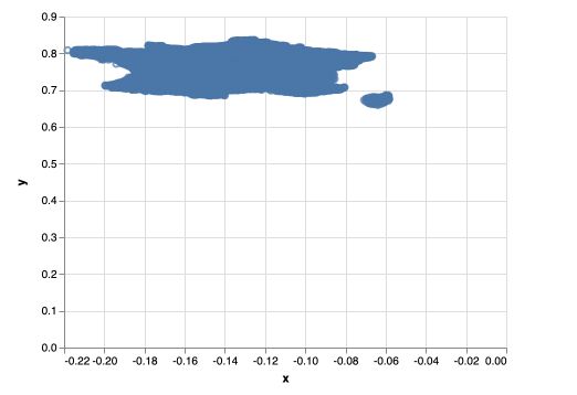
alt.Chartis used to declare the chartfranceis the path to our filemark_pointis the type of marker we’re using. We’ll later seemark_circleormark_squareencodeis used to encode the variablesx='x:Q'means that we encode the column x to being quantitative. Same for the y column.
There is a major issue with the graph above, the origin of the plot is (0,0). We need to change that. We will also delete the axis values :
alt.Chart(france).mark_point().encode(
    x=alt.X('x:Q', axis=None),
    y=alt.Y('y:Q', axis=None, scale=alt.Scale(zero=False)))
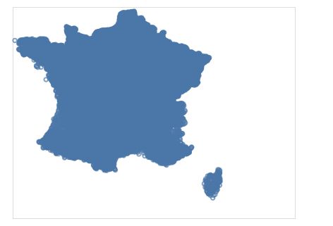
Notice how we now declare the axis as objects in Altair using alt.X and alt.Y. We also disable the zero scale.
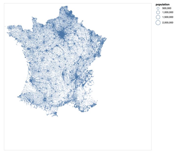
The points above are a bit too big. Let’s reduce their size in the mark_point. We will also assign the graph to a variable, and call that variable. We are also maxing the graph a bit bigger :
map = alt.Chart(france, width=600, height=600).mark_point(size=1).encode(
    x=alt.X('x:Q', axis=None),
    y=alt.Y('y:Q', axis=None, scale=alt.Scale(zero=False))
)

map
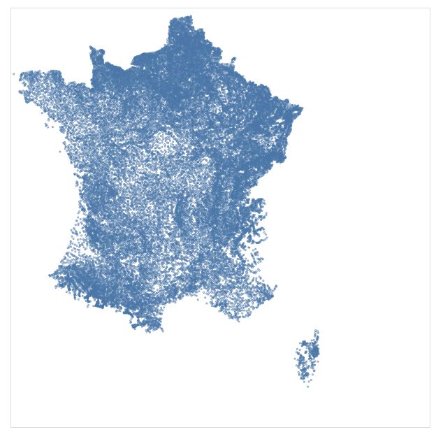
Size
Let’s now set the size of the marks accordingly to the population of the city.
map = alt.Chart(france, width=600, height=600).mark_point(size=1).encode(
    x=alt.X('x:Q', axis=None),
    y=alt.Y('y:Q', axis=None, scale=alt.Scale(zero=False)),
    size='population:Q',
)

map
Notice that we can also declare the size as an object itself using :
size = alt.Size('population:Q')
Color
Remember that we do have the information of the population density per city. We can decide to set the color depending on the population’s density using alt.Color :
map = alt.Chart(france, width=600, height=600).mark_point(size=0.5).encode(
    x=alt.X('x:Q', axis=None),
    y=alt.Y('y:Q', axis=None, scale=alt.Scale(zero=False)),
    size=alt.Size('population:Q'),
    color=alt.Color('density:Q')
)

map
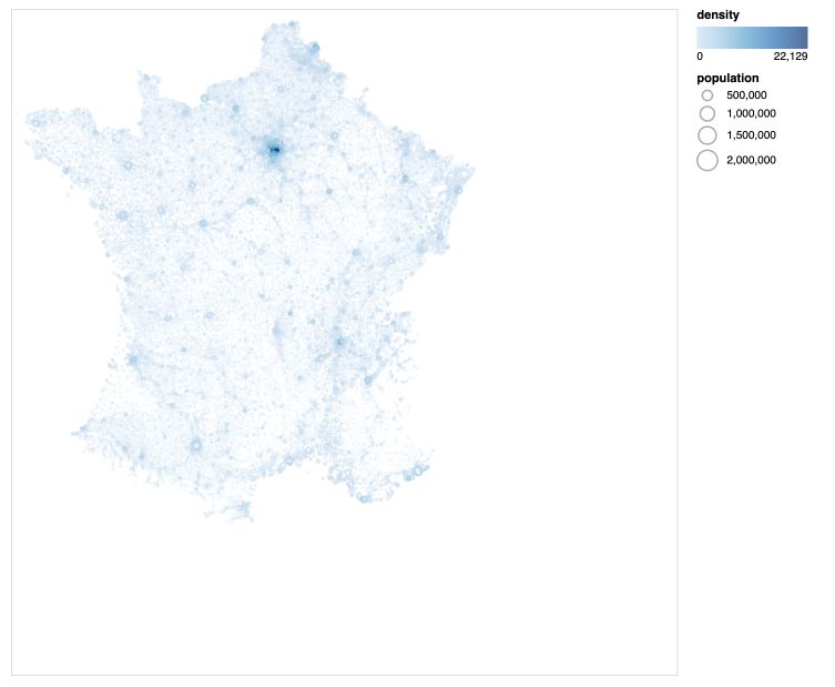
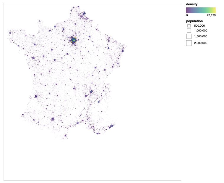
It cool, but we have an issue here: the population’s density is extremely large in Paris and the Ile-de-France region, and the rest of France is too clear. Let’s now define a threshold (say a density of 2000) above which the color doesn’t change. We will also use a color template.
map = alt.Chart(france, width=600, height=600).mark_point(size=0.5).encode(
    x=alt.X('x:Q', axis=None),
    y=alt.Y('y:Q', axis=None, scale=alt.Scale(zero=False)),
    size=alt.Size('population:Q'),
    color=alt.Color('density:Q', scale=alt.Scale(scheme='viridis', domain=[0,2000]))

)

map
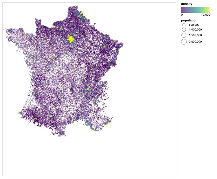
That looks much better ! We can see the main cities of France appear in yellow on the map.
Marks
So far, we’ve only used mark_point as a marker. We can specify the marker’s shape according to the following rules :
For example :
map = alt.Chart(france, width=600, height=600).mark_square(size=1000).encode(
    x=alt.X('x:Q', axis=None),
    y=alt.Y('y:Q', axis=None, scale=alt.Scale(zero=False)),
    size=alt.Size('population:Q'),
    color=alt.Color('density:Q', scale=alt.Scale(scheme='viridis'))

)

map
Histograms
To create histograms, there are three modifications to make :
- use
mark_barmarker - specify a bin, i.e the number of categories to create on the X-axis
- display the sum of the category (or the mean, count, std… for example) on the Y-axis
population = alt.Chart(france, width=600, height=300).mark_bar().encode(
    x=alt.X('population:Q', bin=alt.Bin(maxbins=60)),
    y='sum(population):Q')

population
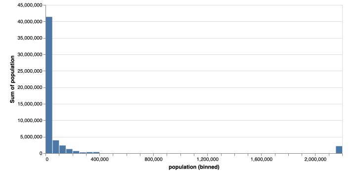
Try to do the same for density on your side, and call it density.
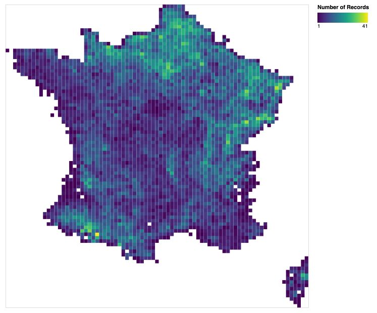
Heatmaps
If you add a bin on the Y-axis too, you obtain a heatmap! We will now create a heatmap of France, that aggregates information within the region (class X and class Y), and displays the count of the number of records within this region :
heat_map = alt.Chart(france, width=600, height=600).mark_square(size=50).encode(
    x=alt.X('x:Q', axis=None, bin=alt.Bin(maxbins=90)),
    y=alt.Y('y:Q', axis=None, scale=alt.Scale(zero=False), bin=alt.Bin(maxbins=90)),
    color=alt.Color('count(population):Q', scale=alt.Scale(scheme='viridis')))

heat_map
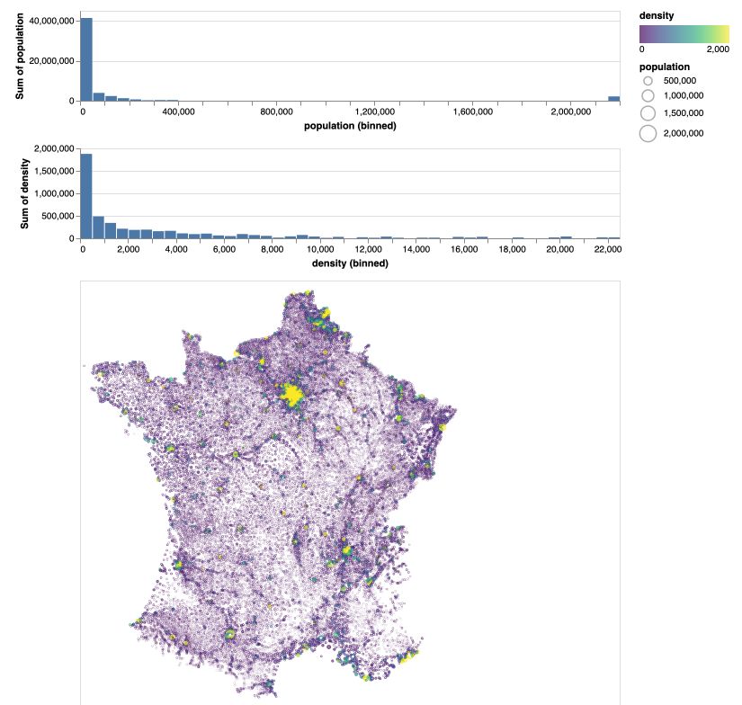
Dashboards
One of the nice features in Altair is to be able to build, as in Tableau, nice looking Dashboards. For example, here’s how to display the two histograms and the map of France we just built :
population.properties(height=100) & density.properties(height=100) & map
Interactive charts
Altair is great for developing interactive charts.
Tooltips
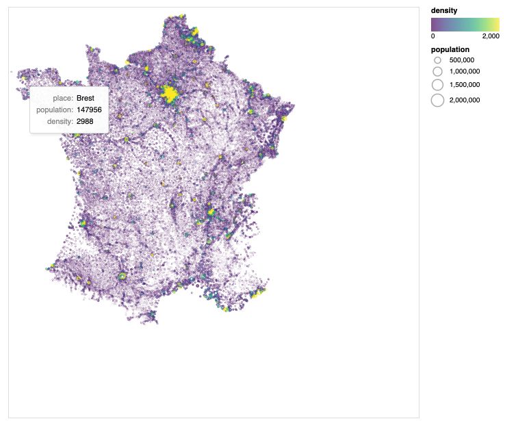
The first step toward developing interactive charts is to integrate tooltips. Tooltips display a certain text message on overlay. For example :
map = alt.Chart(france, width=600, height=600).mark_point(size=0.5).encode(
    x=alt.X('x:Q', axis=None),
    y=alt.Y('y:Q', axis=None, scale=alt.Scale(zero=False)),
    size=alt.Size('population:Q'),
    tooltip=['place:N', 'population:Q', 'density:Q'],
    color=alt.Color('density:Q', scale=alt.Scale(scheme='viridis', domain=[0,2000]))

)

map
Selection intervals
In some cases, you might want to select a specific region of the map. This is done by adding a selection interval on the map :
brush = alt.selection_interval()
map.add_selection(brush)
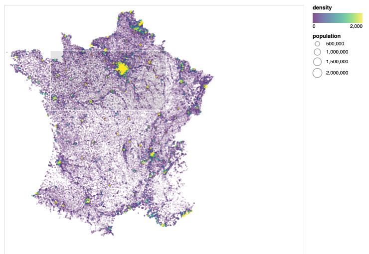
As you might guess, this is quite pointless so far. We need to add more features, such as setting to gray the non-selected part using the alt.value argument in the color.
map = alt.Chart(france, width=600, height=600).mark_point(size=1).encode(
    x=alt.X('x:Q', axis=None),
    y=alt.Y('y:Q', axis=None, scale=alt.Scale(zero=False)),
    size='population:Q',
    tooltip=['place:N', 'population:Q', 'density:Q'],
    color=alt.condition(brush, 'density:Q', alt.value('lightgrey'), scale=alt.Scale(scheme='viridis', domain=[0,2000]))
).add_selection(brush)

map
Transform filters
At that point, this is a cool feature, but it remains useless. What we might want to do is on the Dashboard, when a region is selected on the map, update it on the histograms (to get for example the population’s histogram in this region).
This can be achieved using transform_filter.
population = population = alt.Chart(france, width=800, height=100).mark_bar().encode(
    x=alt.X('population:Q', bin=alt.Bin(maxbins=60)),
    y='sum(population):Q').transform_filter(brush)

population & map
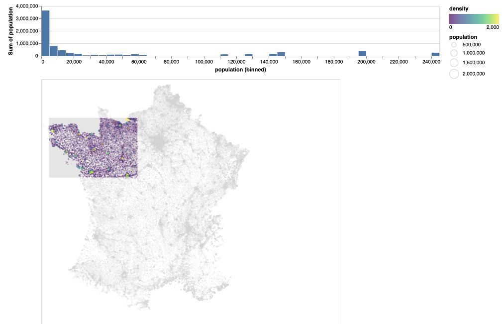
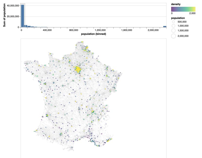
As you can see, the transformation filter refers to the brush filter. This is interesting. The last improvement we’ll explore is to update the view in both ways. If we select a region of the histogram, it will update the map.
Start off by defining the two selection intervals :
brush = alt.selection_interval()
pop_selection = alt.selection_interval(encodings=['x'])
Then, define the map and add a selection according to population, and define the population histogram, add the population selection and add the transformation.
map = alt.Chart(france, width=600, height=600).mark_point(size=1).encode(
    x=alt.X('x:Q', axis=None),
    y=alt.Y('y:Q', axis=None, scale=alt.Scale(zero=False)),
    size='population:Q',
    color=alt.condition(pop_selection, 'density:Q', alt.value('lightgrey'), scale=alt.Scale(scheme='viridis', domain=[0,2000]))
).add_selection(brush)

population = alt.Chart(france, width=600, height=100).mark_bar().encode(
    x=alt.X('population:Q', bin=alt.Bin(maxbins=50)),
    y='sum(population):Q'
).add_selection(pop_selection).transform_filter(brush)

population & map
Conclusion : That’s it ! I hope this introduction to Altair was interesting. I love to use this on my Data Viz projects. Feel free to leave a comment if you have one.